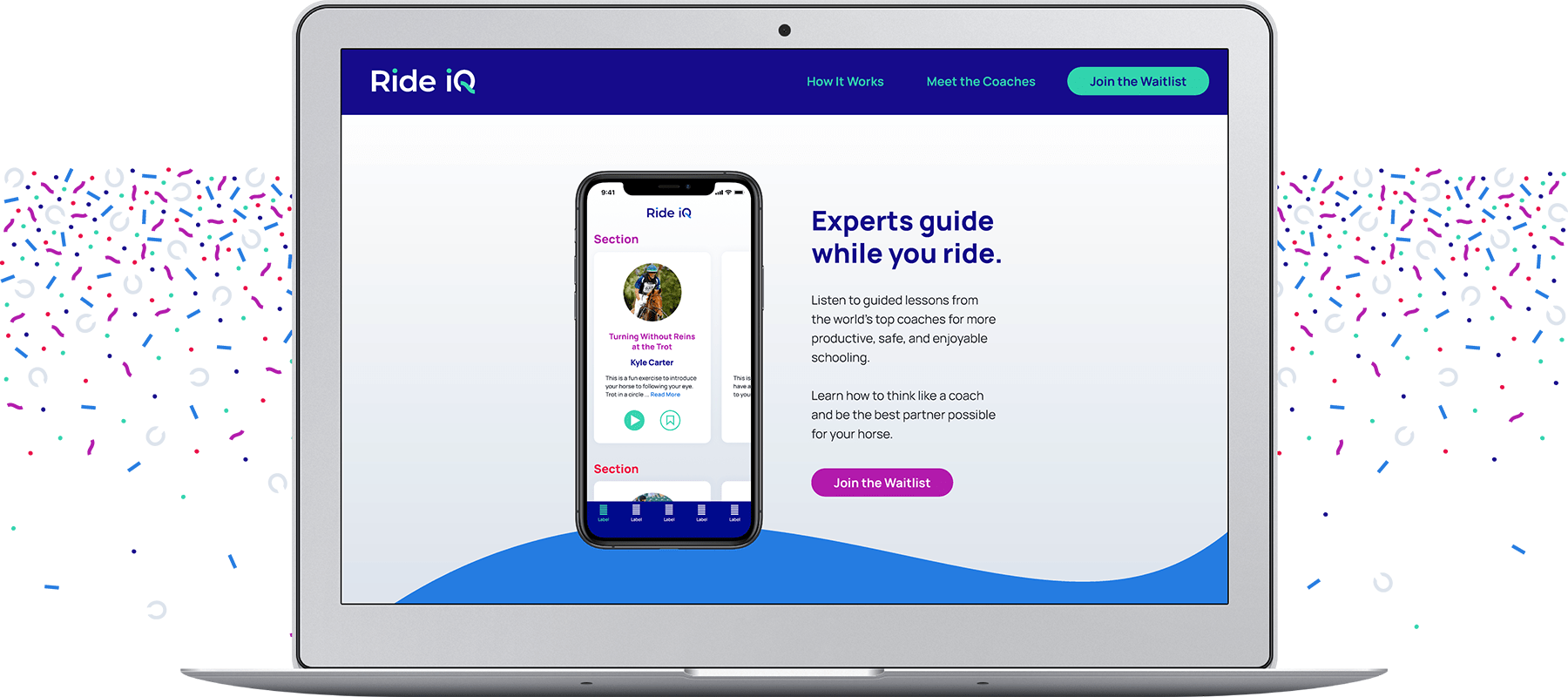
Ride iQ is an app for listen-while-you-ride equestrian lessons with Olympic-level coaches. The masterminds behind Ride iQ came to me with their brilliant idea, and I helped them bring their brand to life. View the identity below and the brand guide here.
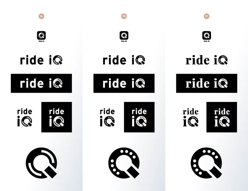
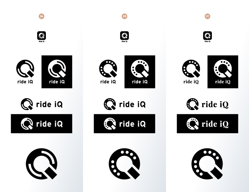
For the first round of brandmarks, I showed the client 3 directions with 2 options each.

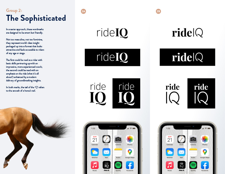
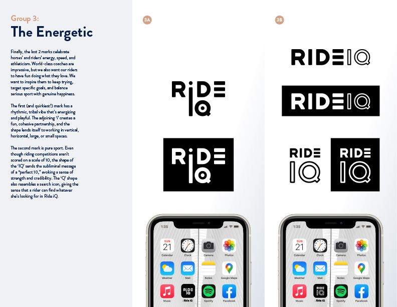
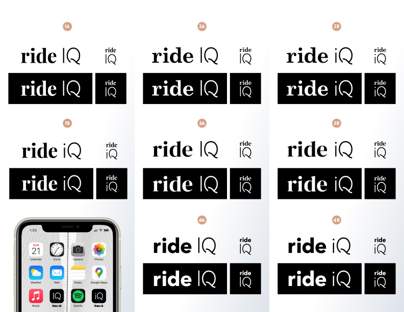
The first featured a Q symbol that visually referenced a horseshoe, a match to “light a fire under” the rider, a microphone to amplify coaches voices to reach more riders, a power button to empower riders to train safely and productively at their own pace, a light bulb for insight, and a vanity mirror to pump up a rider before show time. The second concept offered a sophisticated typographic approach, and the third celebrated horses’ and riders’ energy, speed, and athleticism with a sporty, playful approach. The client asked to combine the symbolism of group 1 with the style of group 2, so I provided more options.
Missing the sophistication of the original wordmarks, the client asked to see more examples of typographic approaches. They loved the idea of a custom ‘Q’ and decided that they wanted their wordmark to feature a capital ‘R’ in a bold sans-serif typeface.
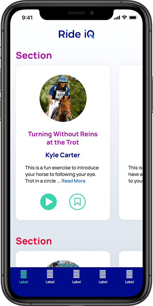
Next, I showed three color palettes with light and dark applications of each. In addition to applying the colors to the brandmark, I mocked up how the colors could be used in the app, taking accessibility and UI elements into consideration.
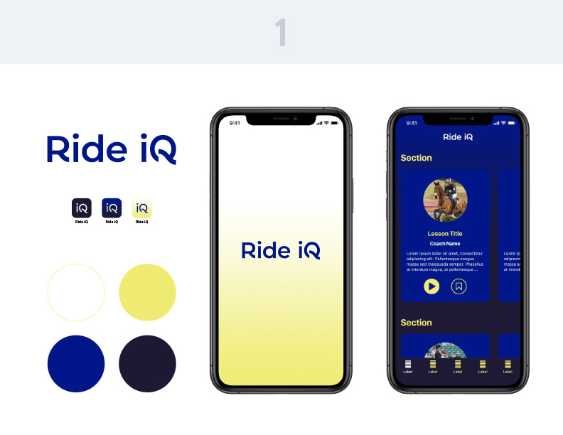
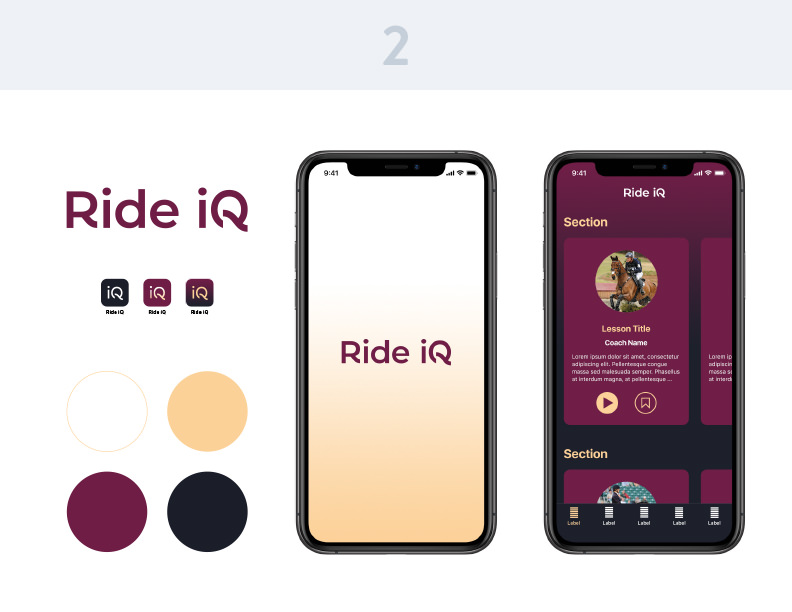
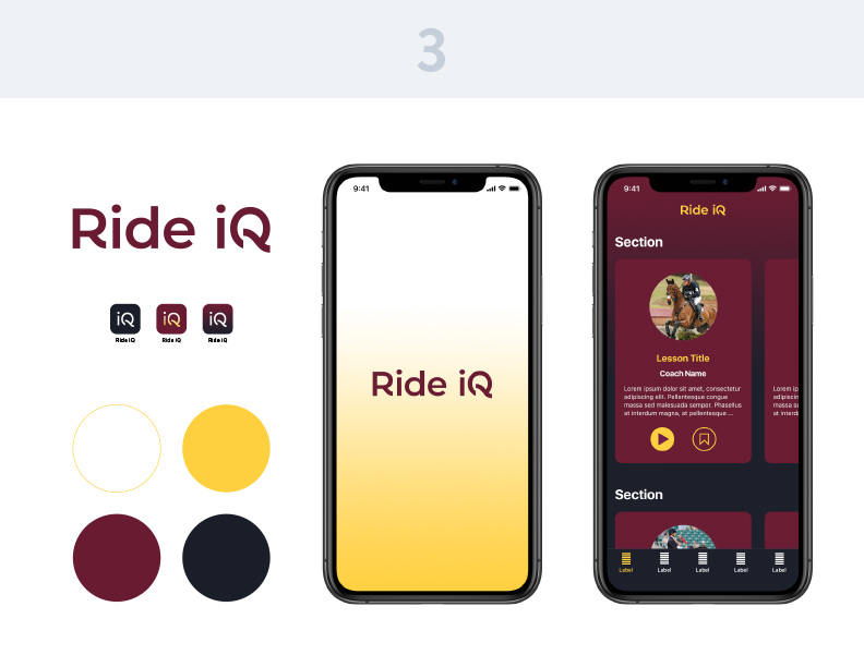
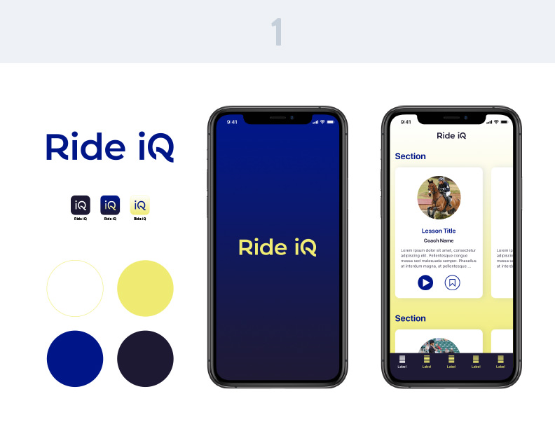
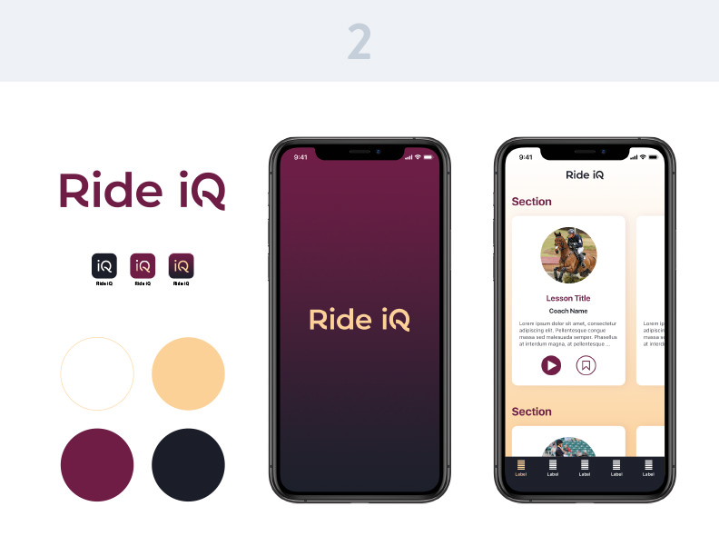
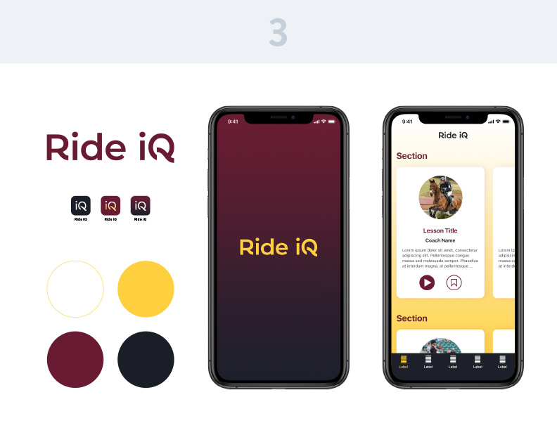
They wanted their palette to be more playful, reminiscent of project management and productivity apps, so I developed a cohesive palette that included more, brighter colors that work well in a user interface and evoke optimism, athleticism, and empowerment.

I explored 8 options for font families, developed a dynamic logo in which the dots on the ‘i’s and the tail of the ‘Q’ change color, and also used those shapes to create a confetti graphic that can be used in the app to celebrate success.


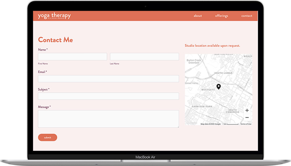
Rachel Breeding is a Certified Yoga Therapist based in Austin, TX. She needed a warm, calming brand to welcome those carrying pain or trauma.
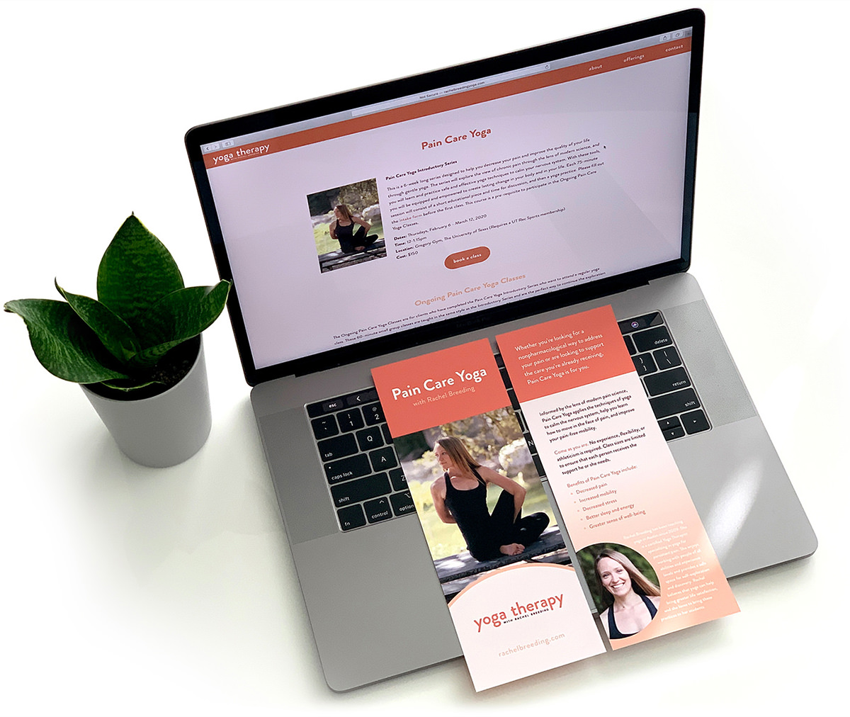
I gave her 8 wordmark options, then translated her desert tones across a flyer and SquareSpace site advertising her services. See the site at rachelbreeding.com.


Ales & Tails serves beer and other beverages to the patrons of the dog parks at Piedmont Park in Atlanta, Georgia. The beer cart fits right in in casual, upscale Midtown, where dog owners sip their brews while watching their pups play.
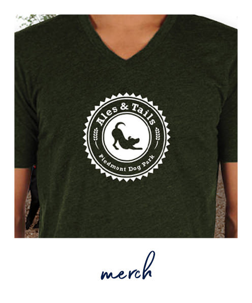
The v-neck is made from 100% organic cotton, satisfying the hippest of Midtown dog owners. It’s a fun way to show your love for dogs and hops, and it helps spread the word about one of Piedmont Park’s best kept secrets.
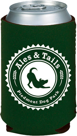
It’s ruff juggling a dog and a drink, but the koozie makes sure your drink doesn’t leave your hand. The colors complement the park, and the logo reminds passers-by that the beer cart is open.

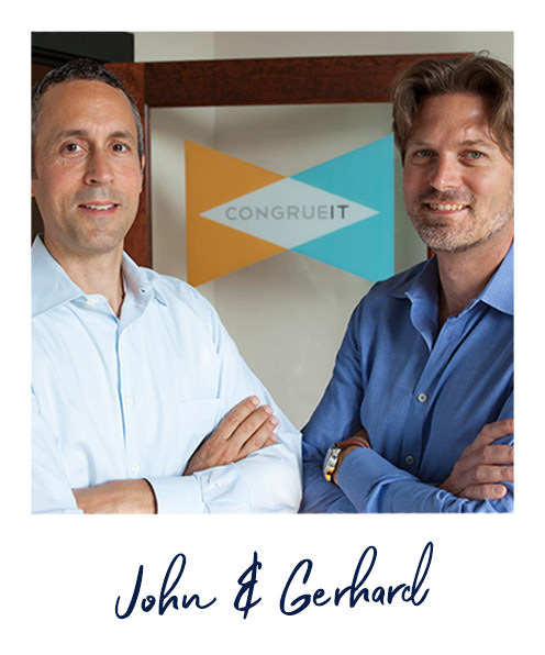
CongrueIT was an online community for those who are or who would like to hire independent IT consultants. Founders John Moser and Gerhard Hacker wanted an identity that communicates the methodology that made their company unique and desirable:
They evaluated clients and consultants based on 3 qualities that form a triangle, then matched consultants and clients based on the consultant’s abilities and the client’s needs — CongrueIT comes in where the triangles overlap.
In the mark, all 3 parties form a bow tie that represents the power suit that consultants wear when they use CongrueIT to amp up their business.
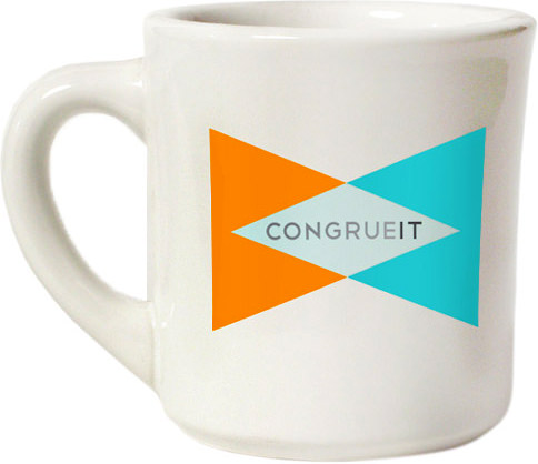
My original color studies used transparency to create the color in the center, but a lighter color was more effective with the word mark. CongrueIT is no longer in business, but the mark could have been a great opportunity for a dynamic logo.


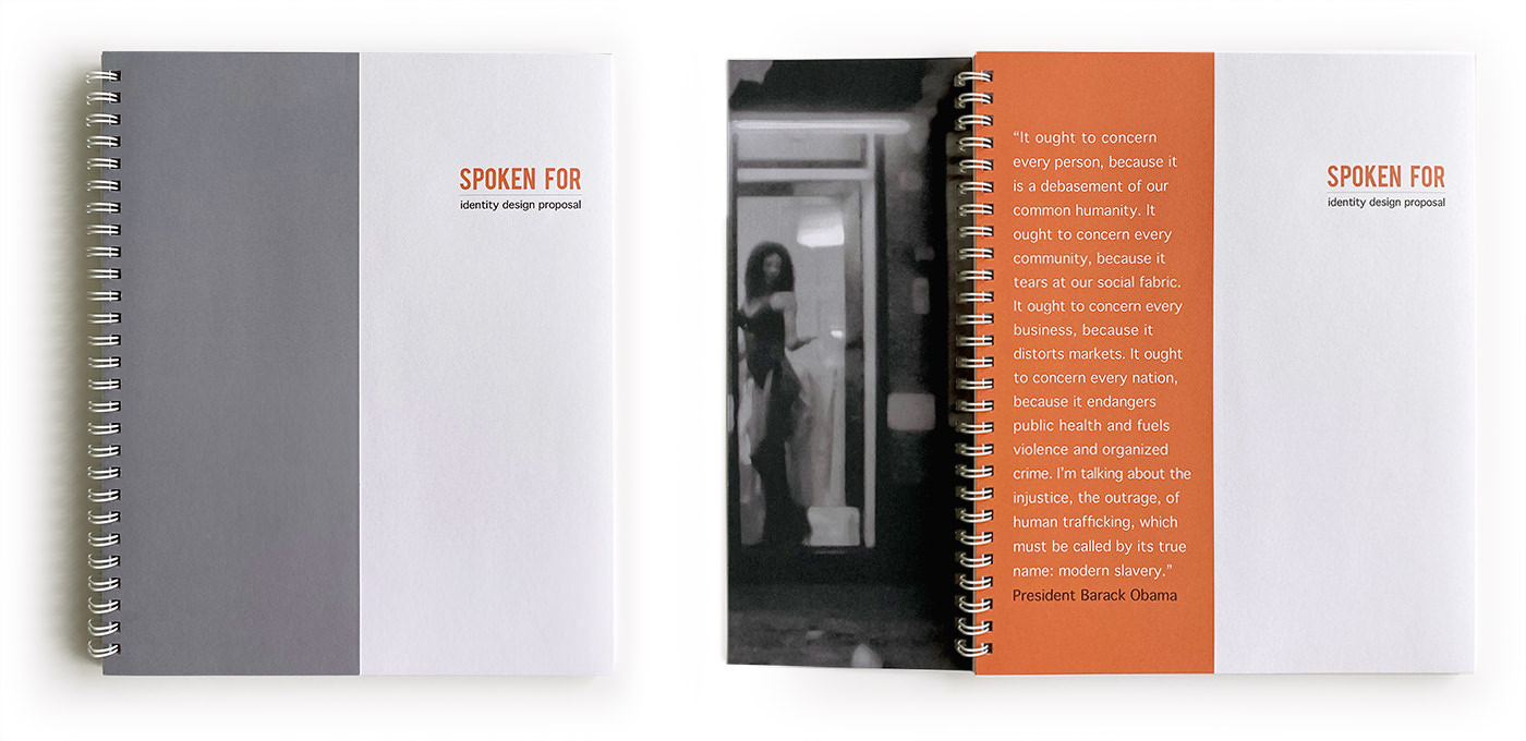
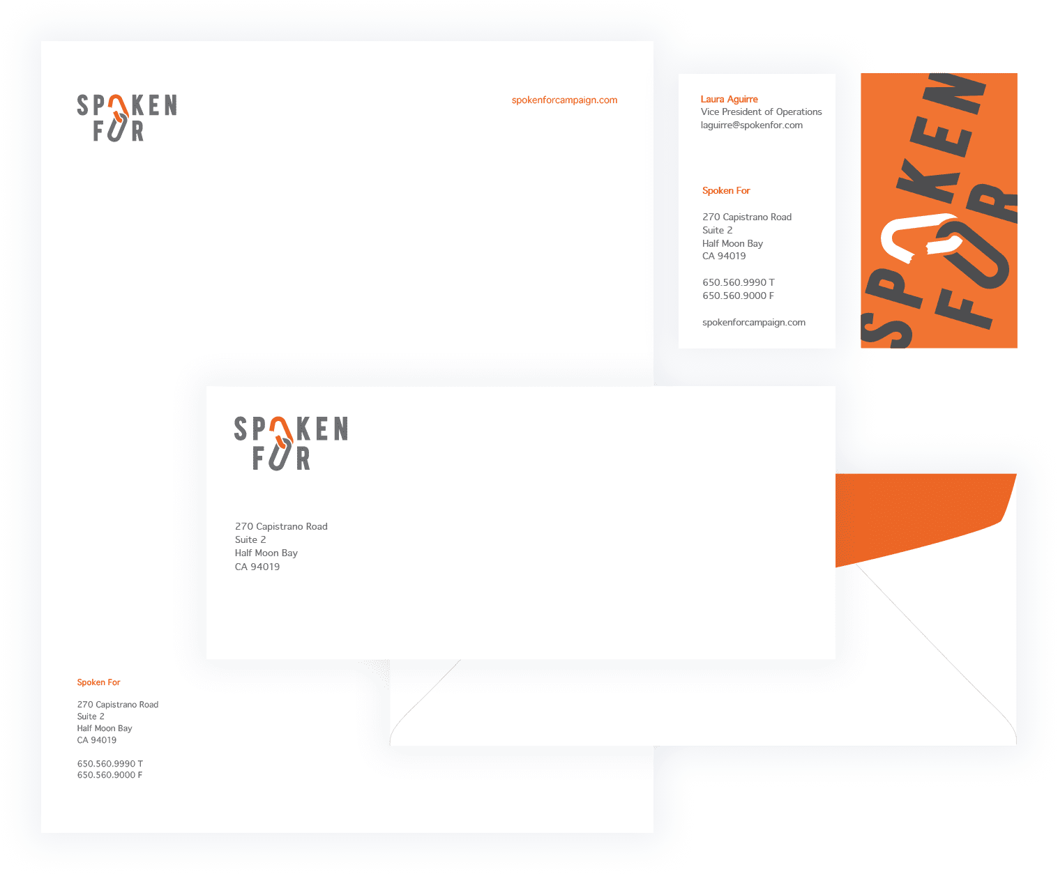
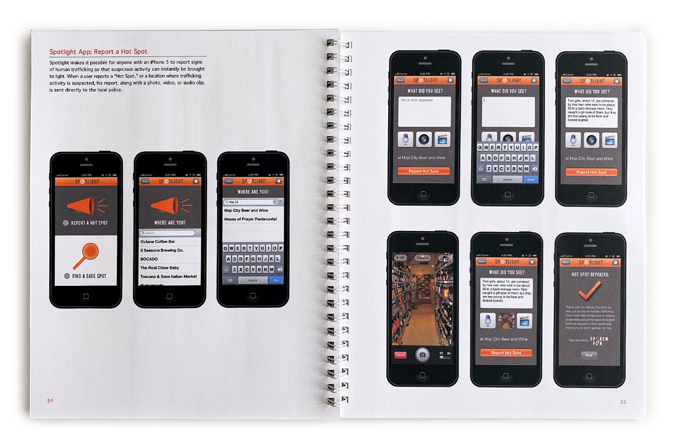
Spoken For is a brand redesign of Not For Sale, an organization that fights modern-day slavery using business creation, supply chain evaluation and aftercare aid around the globe.
The mark embodies the strength of those taking action against human trafficking. Heavy characters reinforce the gravity of trafficking, and the interlocked Os represent the chains literally or metaphorically imprisoning 30 million people.

The cover flap of the identity design proposal book invites the reader to participate in shedding light on modern-day slavery and open the door to finding solutions to end it.
Strong brands need strong stationery.
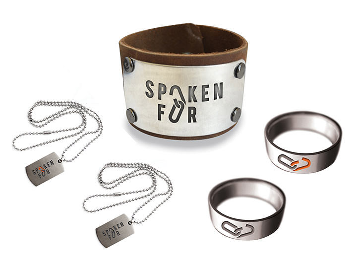
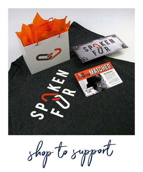
Spoken For’s jewelry, shirts, and bumper stickers help spread awareness and show support. The industrial look and feel continues the theme of literal or metaphorical imprisonment.
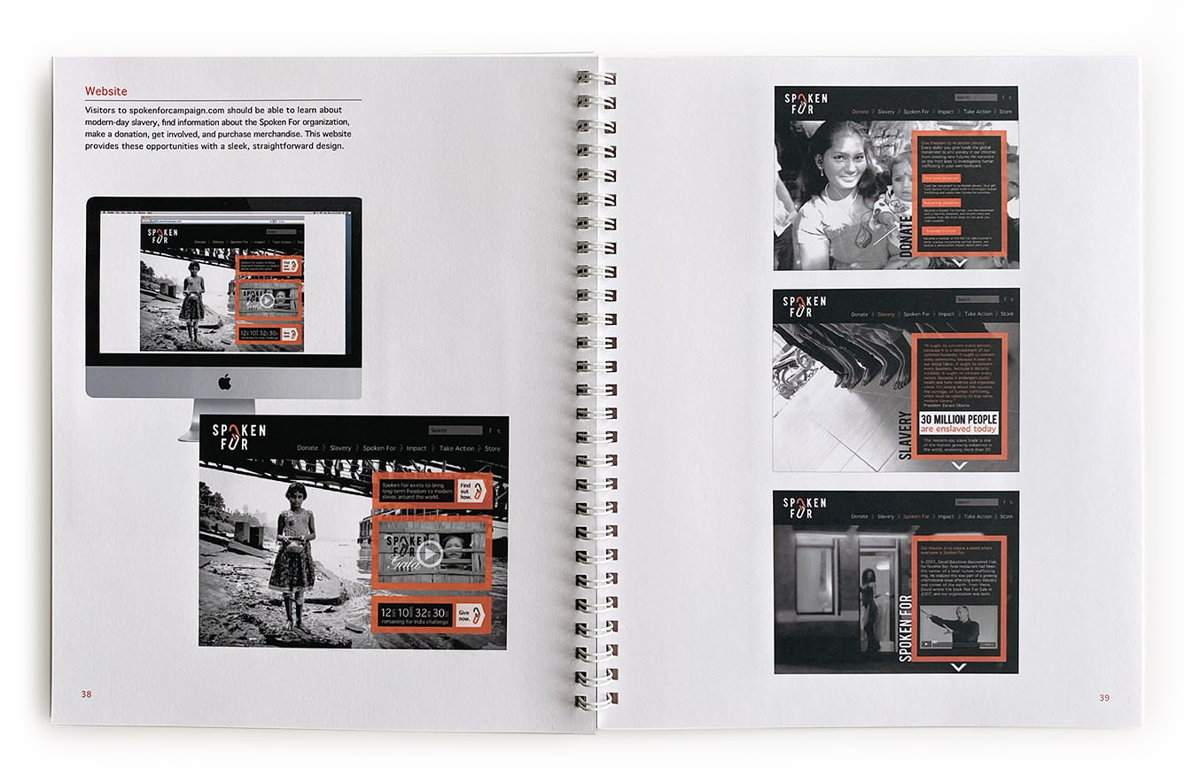
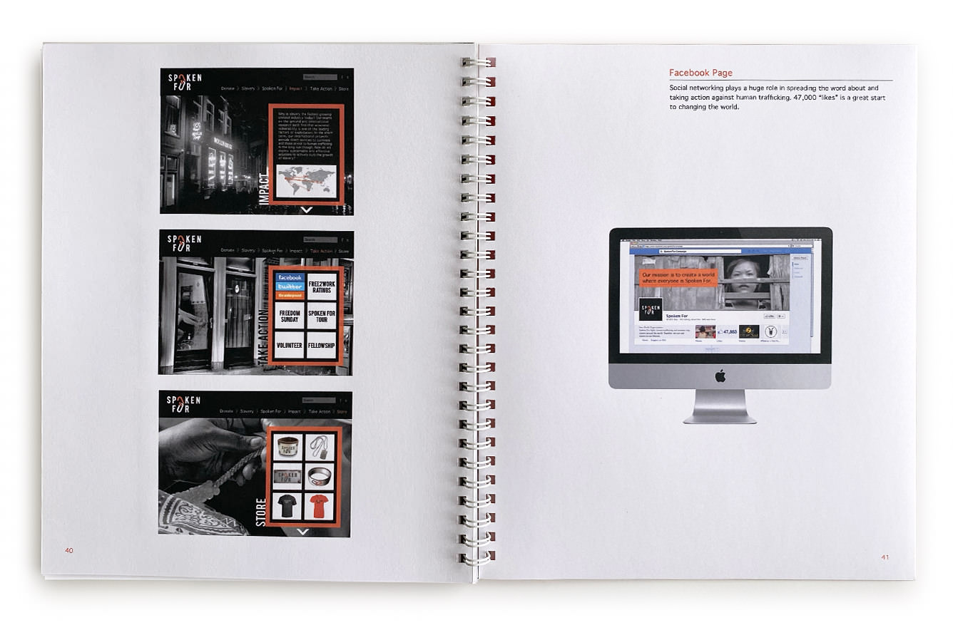
The book also includes designs for Spoken For’s website, Facebook page, and mobile app. The Spotlight app allows users to report “hot spots” of suspicious activity directly to the local police or to find “safe spots” with no reported trafficking suspicions.

ChristChurch Atlanta commissioned a logo for their children’s ministry, “The Woodland,” based on Psalm 1:3. I put together concepts around growth or adventure that incorporated a childlike messiness.
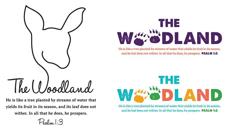
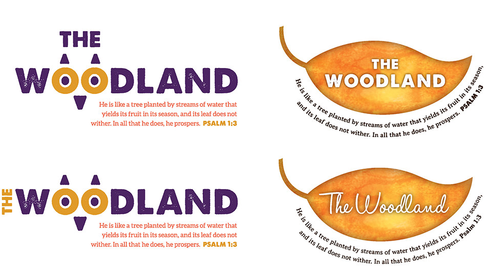
They first chose the paw prints, then pivoted to the owl. They asked for trees and the NLT translation of the verse which draws a stronger connection to children. This graphic now spans the wall along the nursery.
