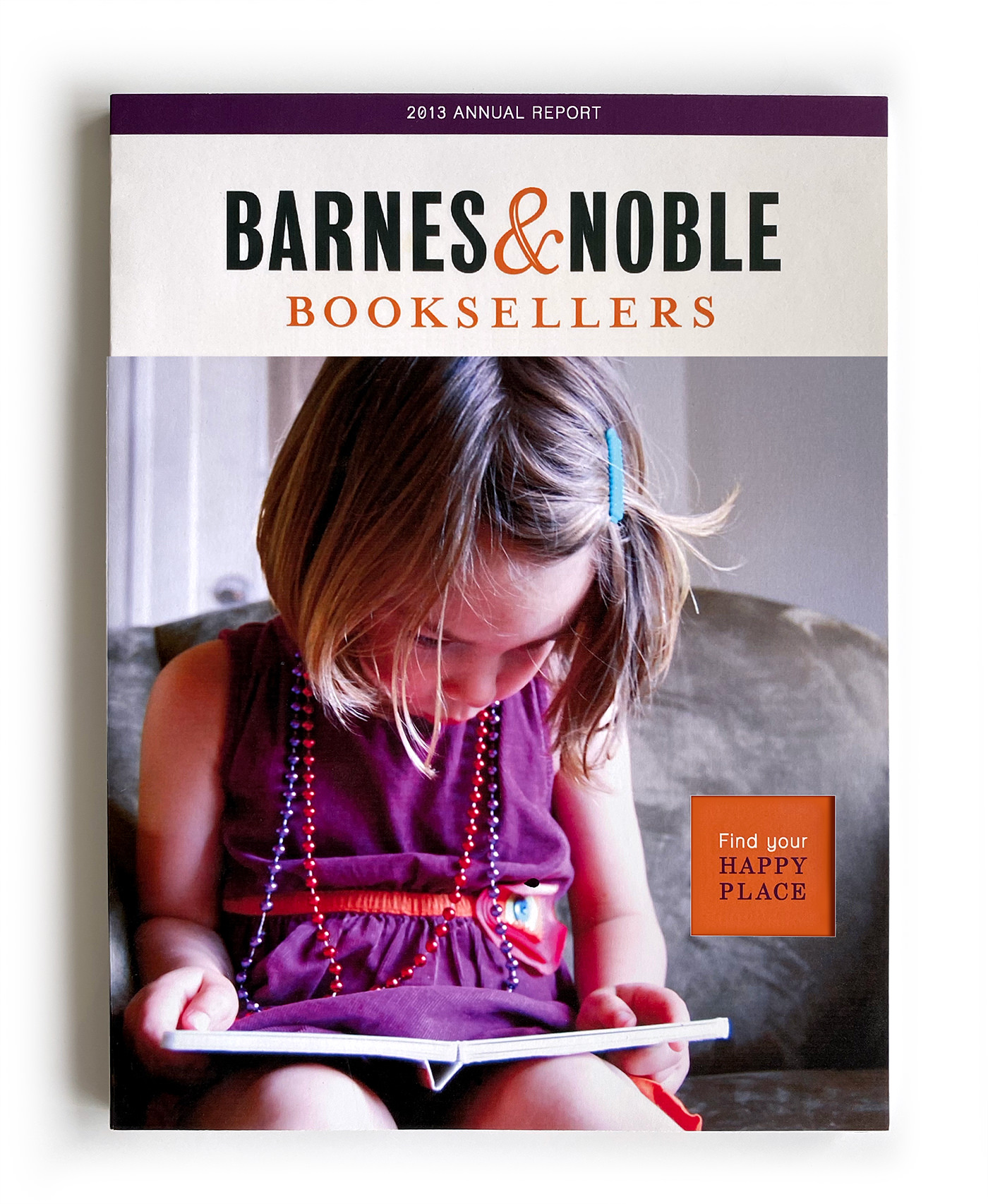
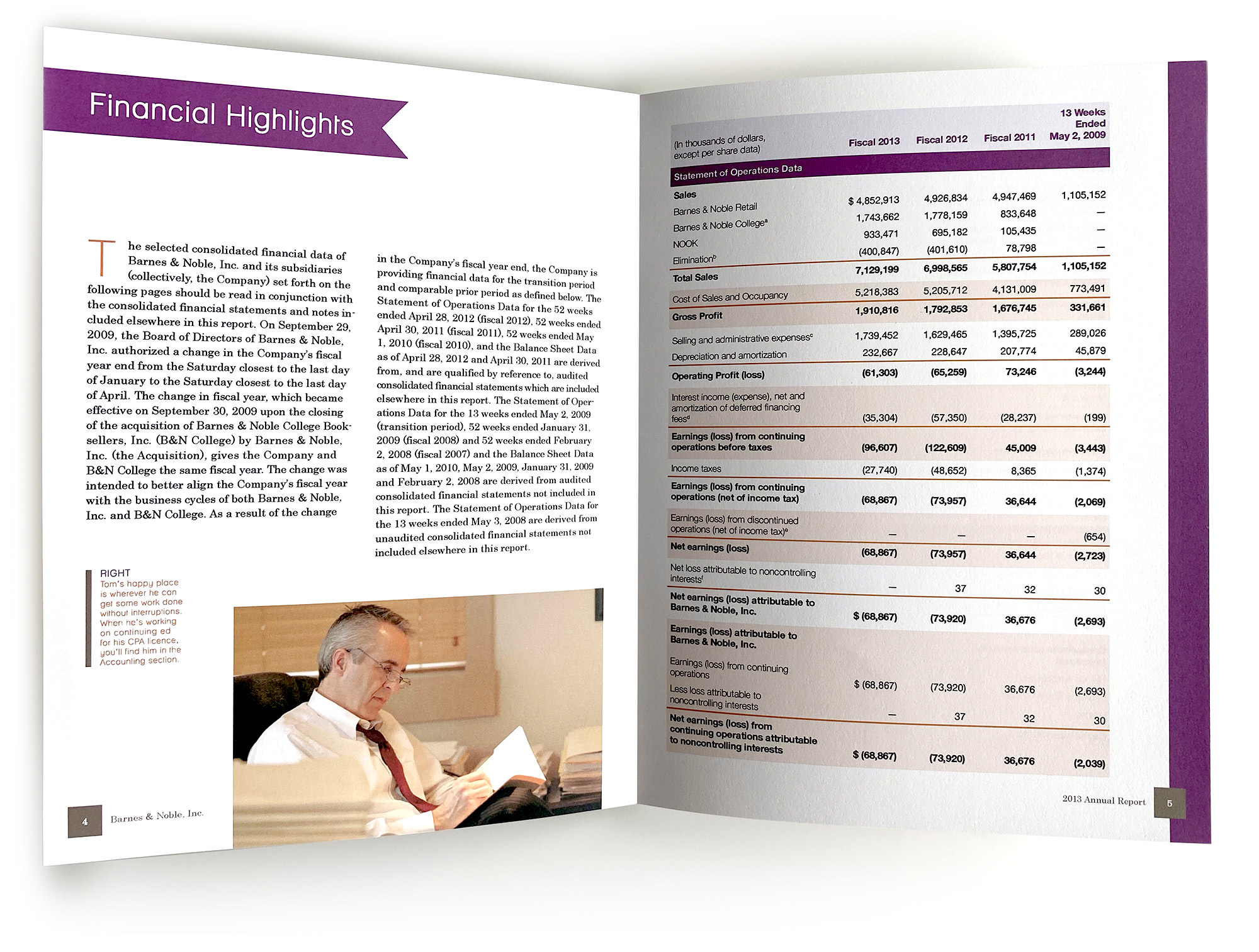
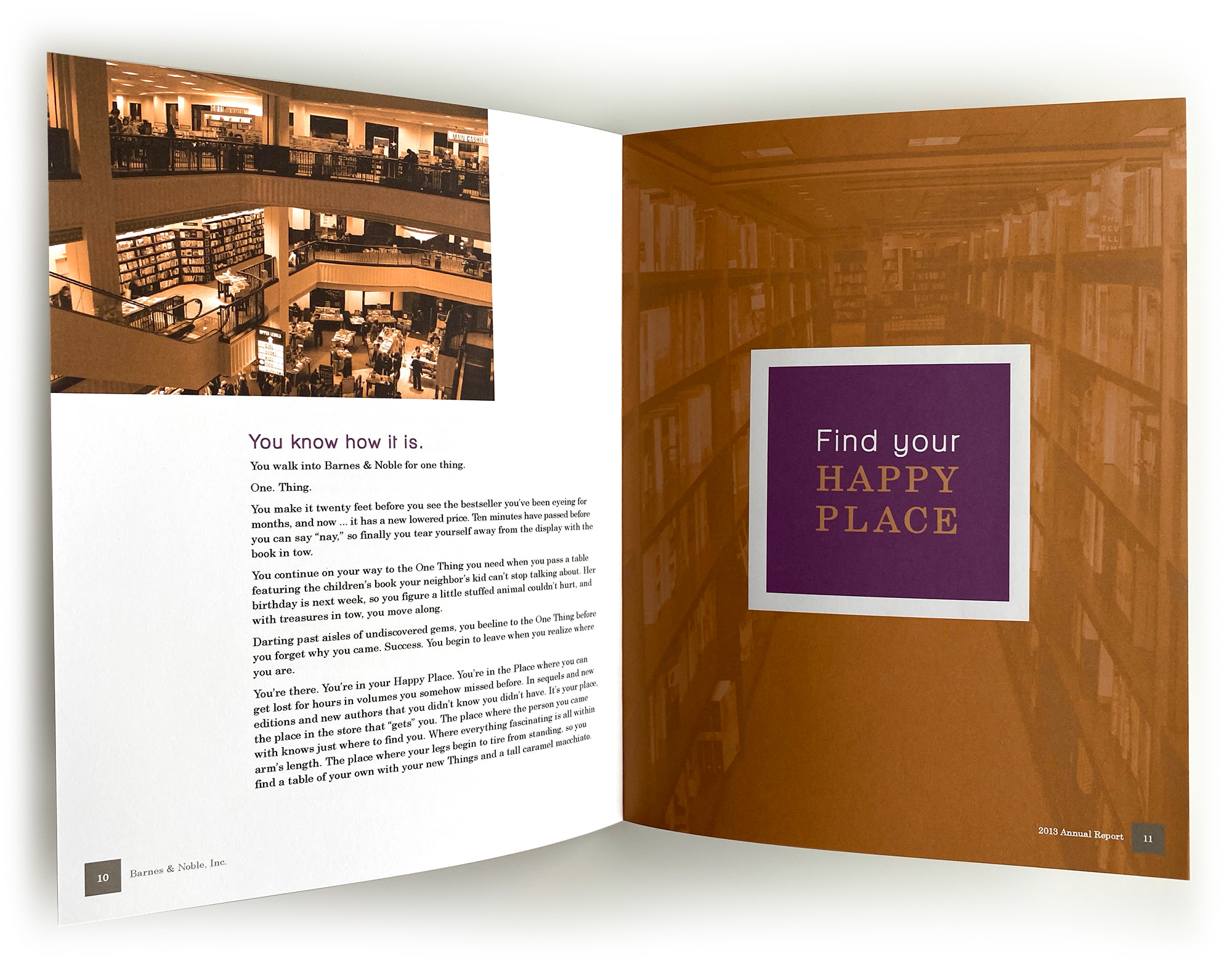
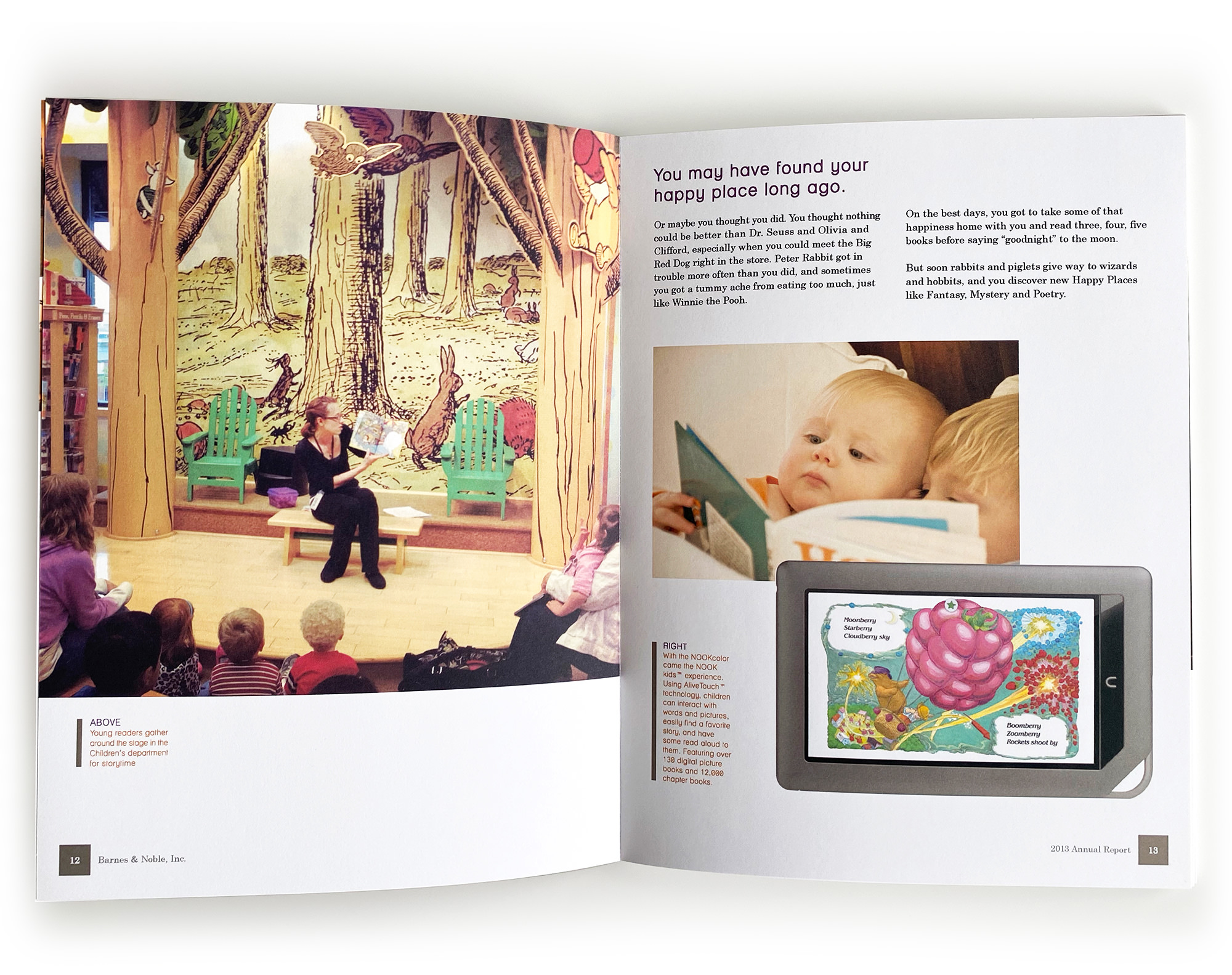
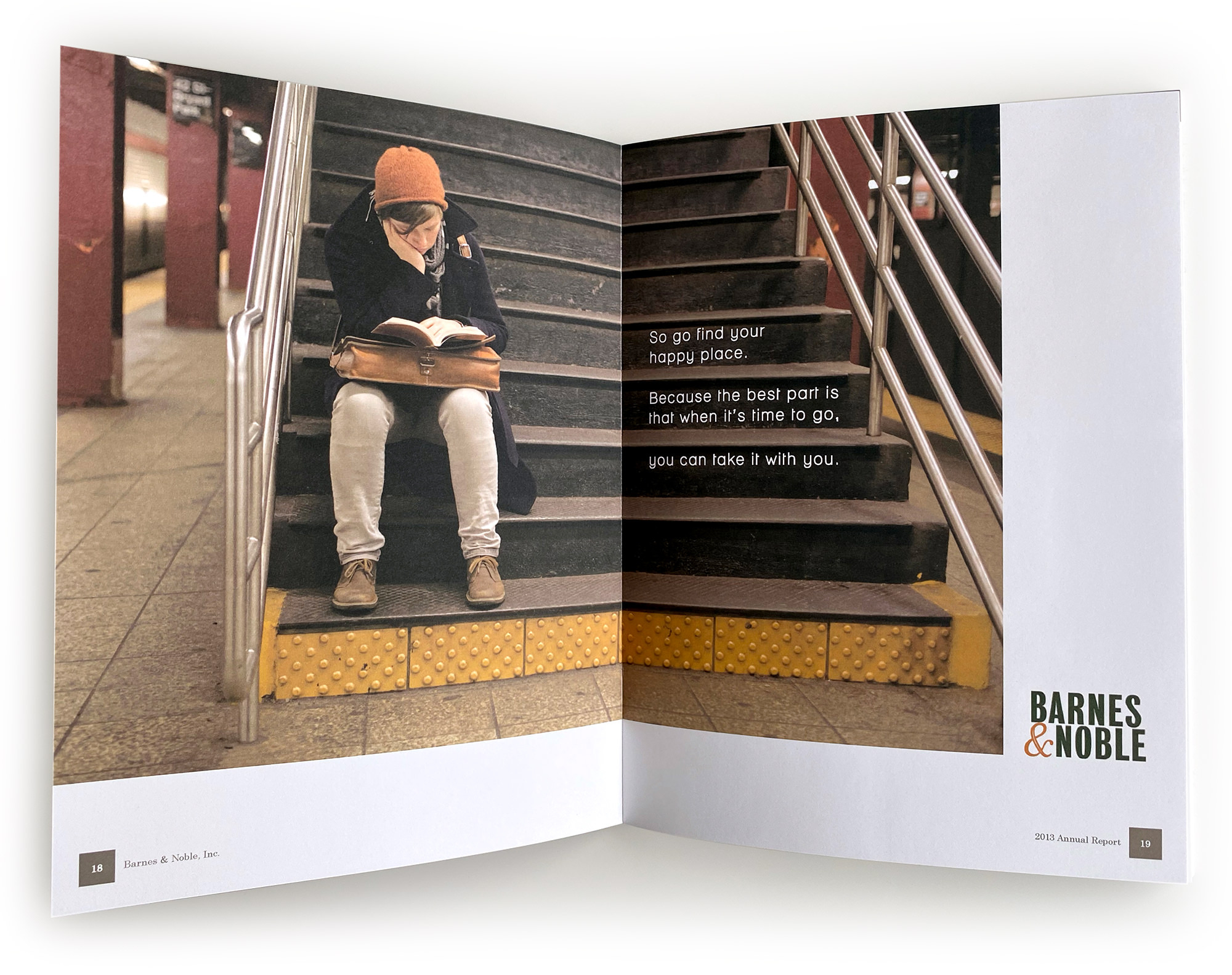
To tell a story bigger than numbers, I centered this 50-page annual report around the concept of “Find your happy place.” Everyone’s happy place is different at B&N, and the report tells the story of how stakeholders helped customers find theirs this year.
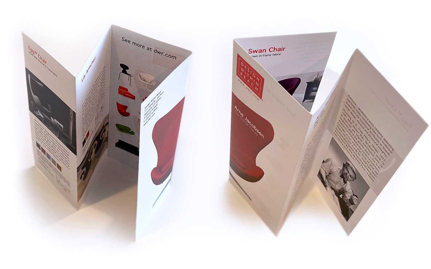
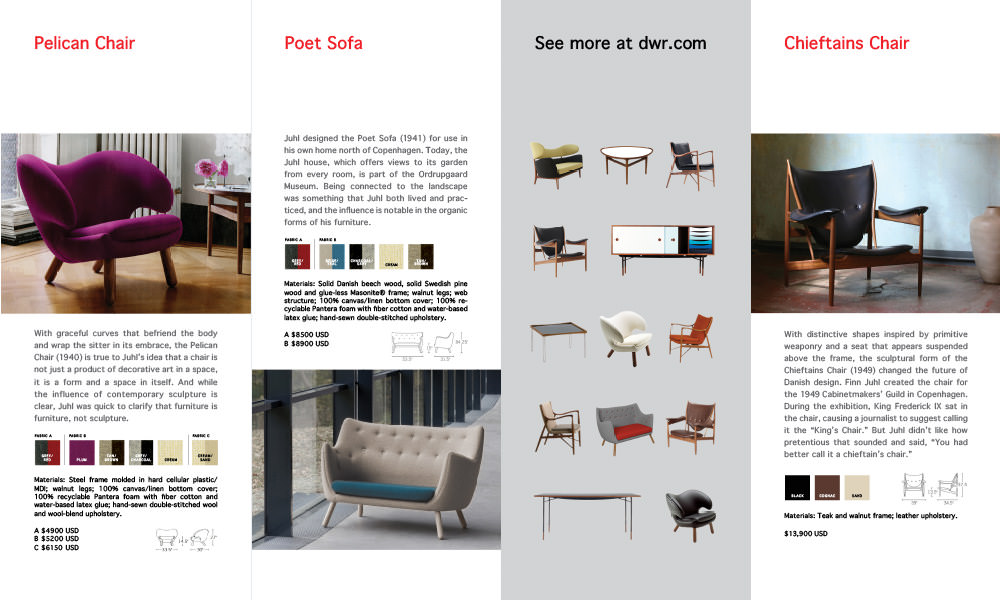
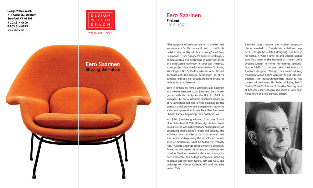
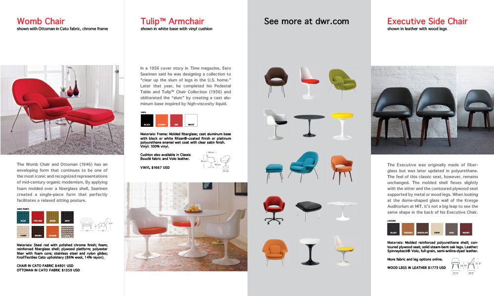
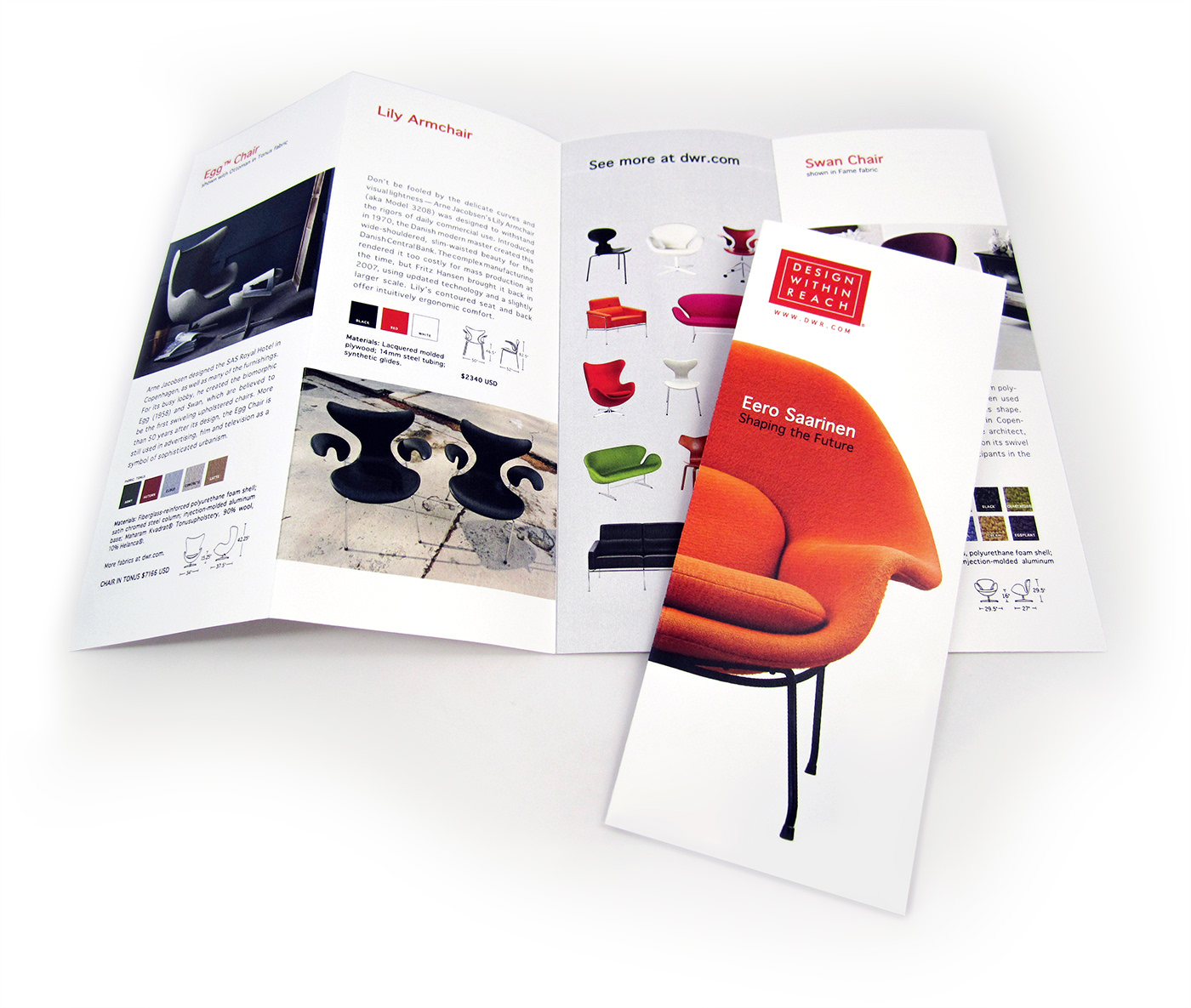
Design Within Reach offers “the best in modern design” with furnishings by designers from the mid-century era to the present. Each brochure features a single designer and includes information about them as well as a selection of their pieces available for purchase at DWR.
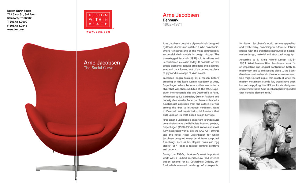
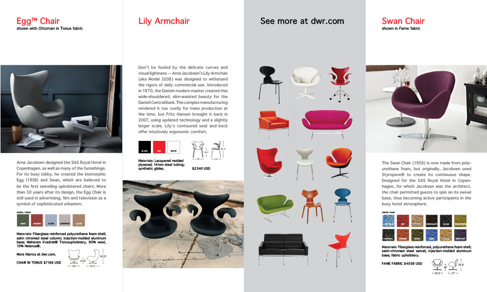
A single piece of furniture activates the space on the exterior of each brochure.
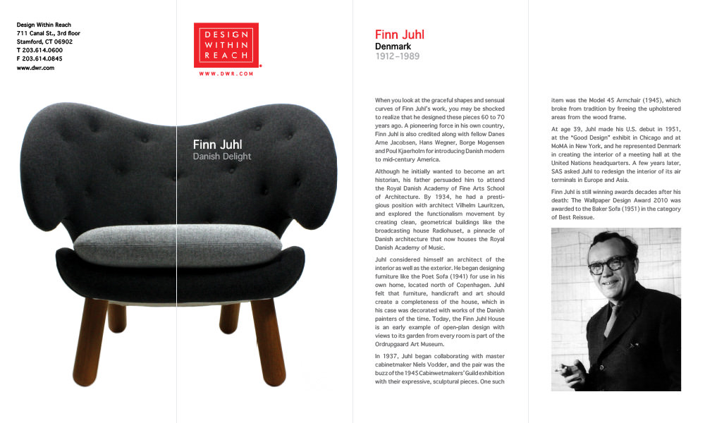
The brochures utilize a parallel fold and fit snugly within a No. 10 envelope.
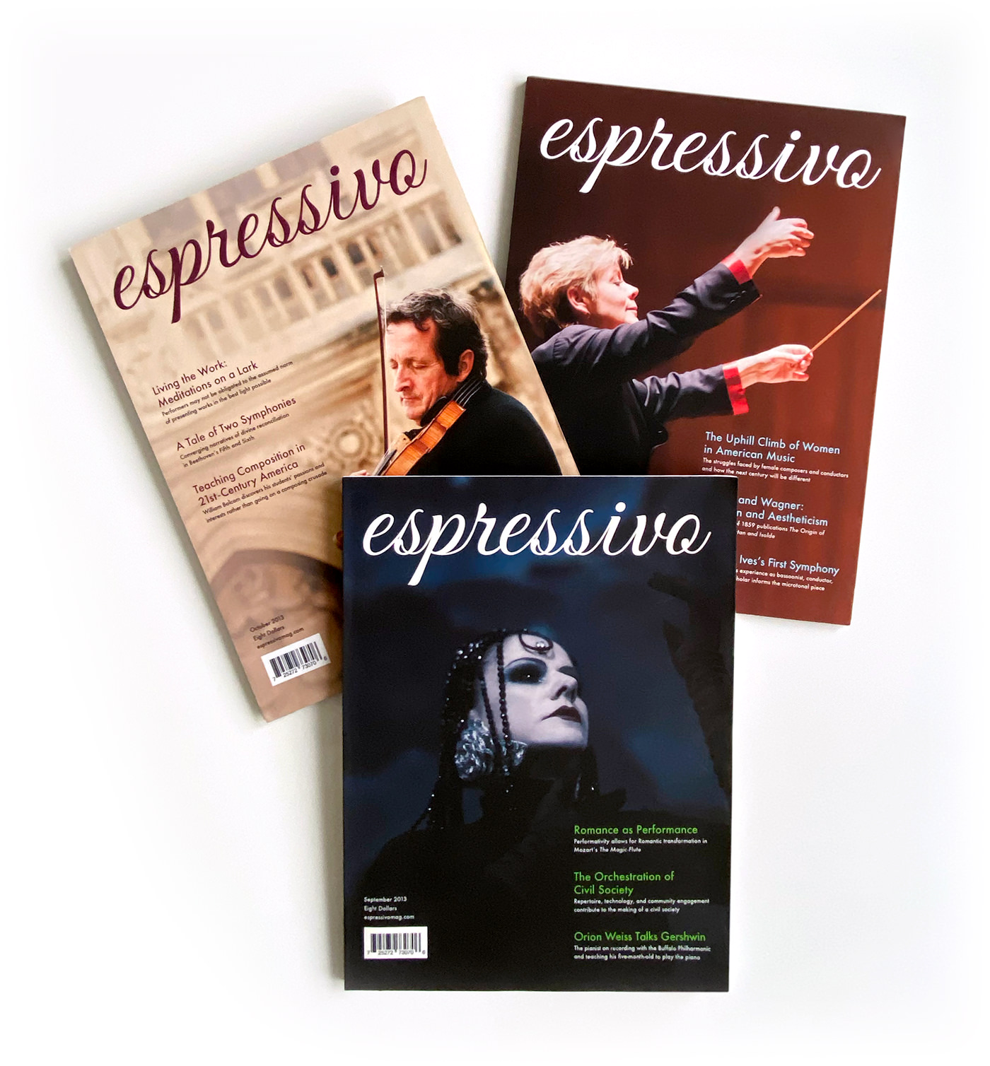
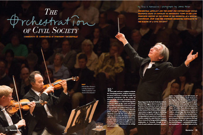
A magazine for classical musicians, “espressivo” is an Italian musical term which tells the musician to play expressively.
The articles are journal quality in length and intellectual rigor, with departmental and feature stories including interviews with professionals, music-specific current events and medical studies, performance reviews, composition analyses, and more.
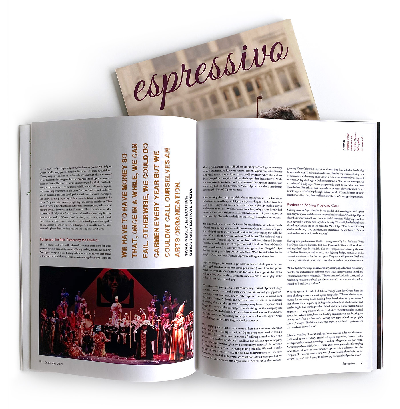
The masthead is set in a script typeface elegant enough to respect the formality of classical music but approachable to symphony musicians and patrons alike. The same can be said for the use of Futura as the sans-serif typeface throughout the magazine. Espressivo is large-format, 9" x 12", which gives it the character of a coffee table book and mimics the oversized feel of the sheet music used in symphony orchestras.
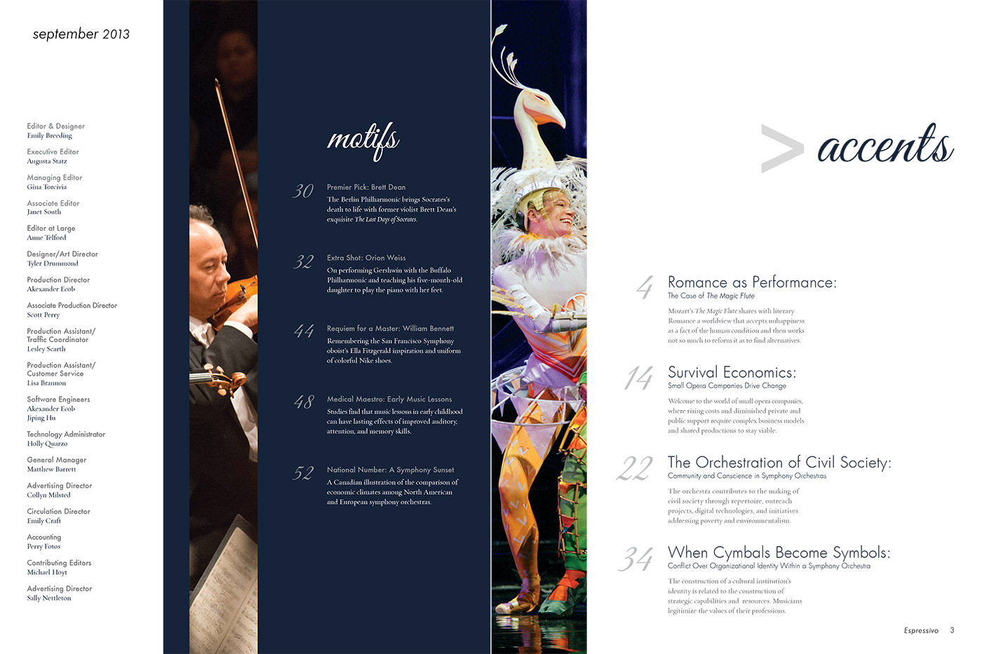
The table of contents spread is based on a three-column grid with the credits on the left, followed by department stories, and features on the right. Department stories like “Premier Pick” and “Extra Shot” are called “motifs” since they’re recurring ‘themes’ each month, while features are “accents,” or emphasized ‘notes.’
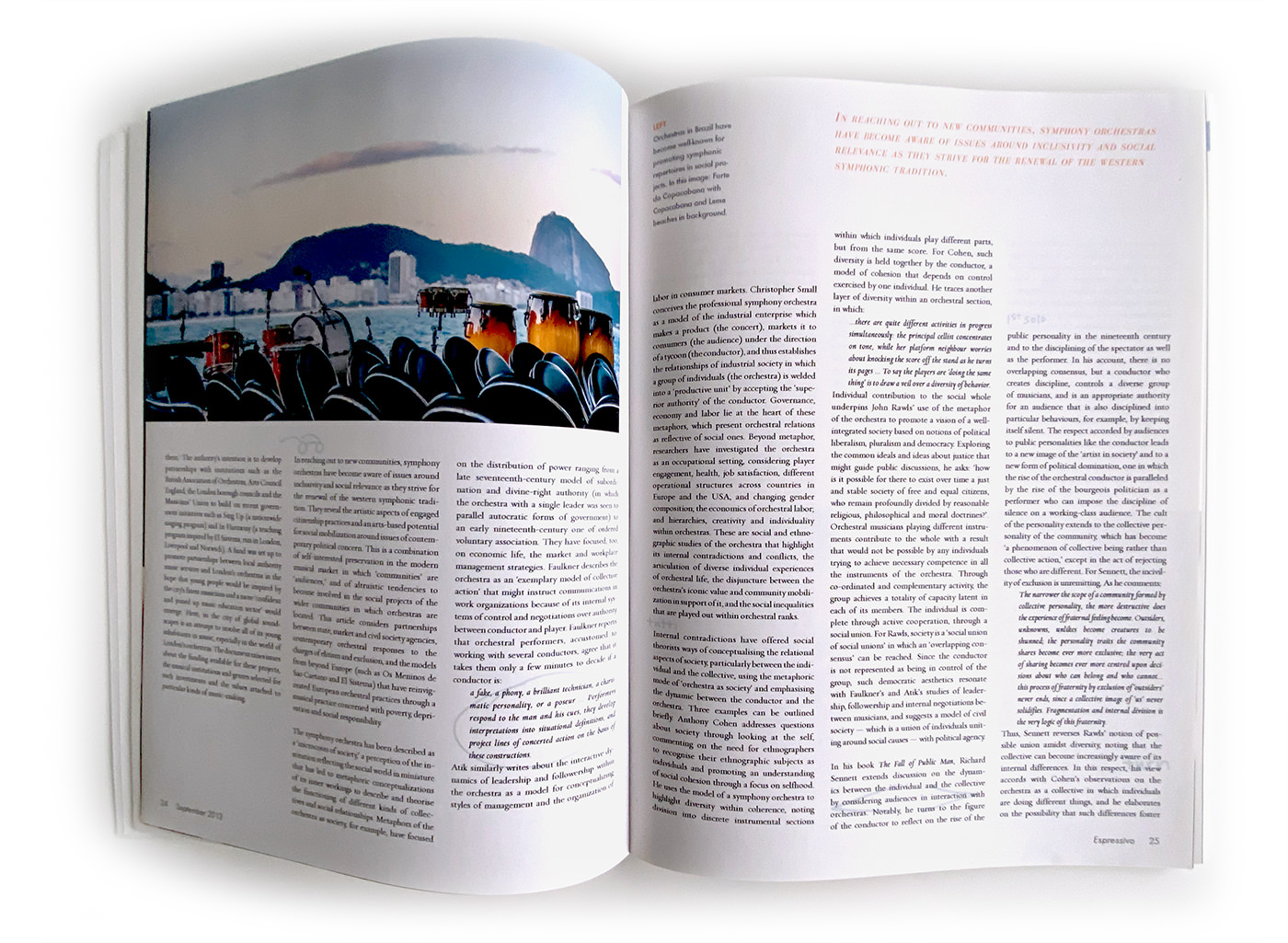
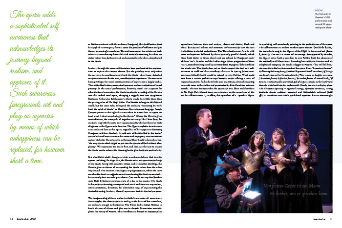
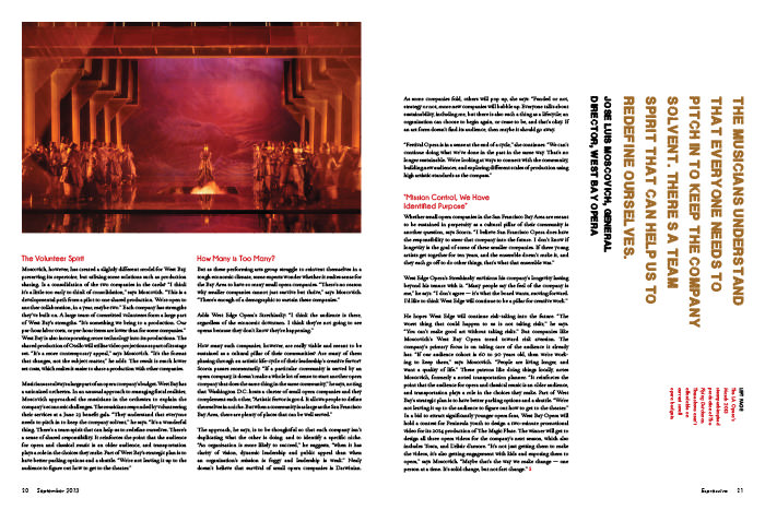
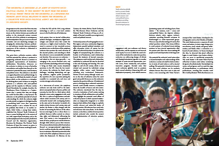
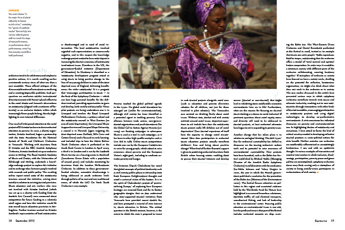
The body copy is justified and set in Requiem throughout the publication. This article compares the structure and internal functions of a symphony orchestra to those of society, so I marked up the copy like a musician makes notes his own sheet music: dynamics, style markings, glasses for “watch the conductor,” etc.
Each story is treated differently, but in such a way that the spreads within a story are cohesive and each story agrees with the elegant character of Espressivo. Simplified versions of these layouts are used for the digital publication of Espressivo.
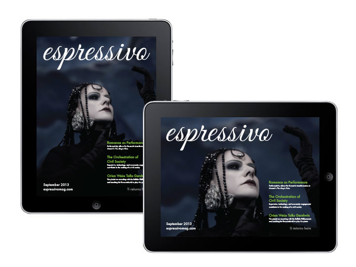
I designed vertical and horizontal digital layouts of Espressivo so the magazine rotates responsively. Swiping left or right moves between stories, and swiping up and down “turns pages.” Tapping a story on the table of contents navigates to it, and tapping the symbol in the bottom corner navigates back to the table of contents.
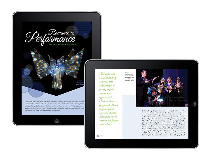
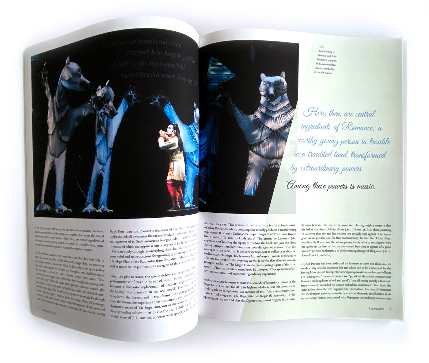
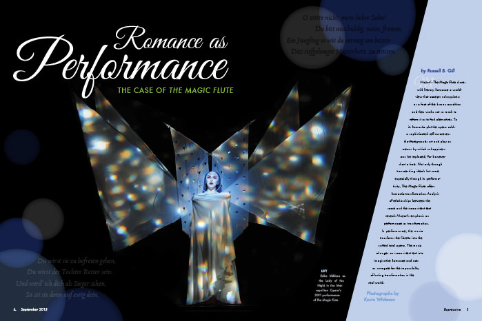
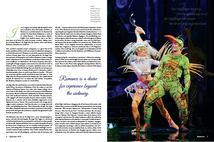
In this article about Mozart’s opera The Magic Flute, each image has an overlay with the lyrics that correspond to the part of the opera from which the photo was taken. The reader can tap the lyrics to play the recording of that section of the opera, which will play until tapped again or until the lyrics on another page are tapped.
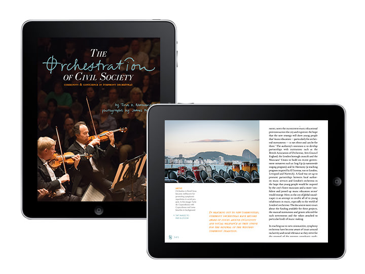
In this article about the Symphony and Society, the reader can pan and zoom each image: tap once to enlarge, pinch and zoom to view parts of the image larger, and tap again to return the image to its original size. Throughout the digital magazine, the body copy scrolls, and each screen represents a printed spread.
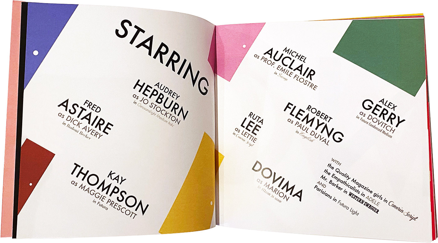
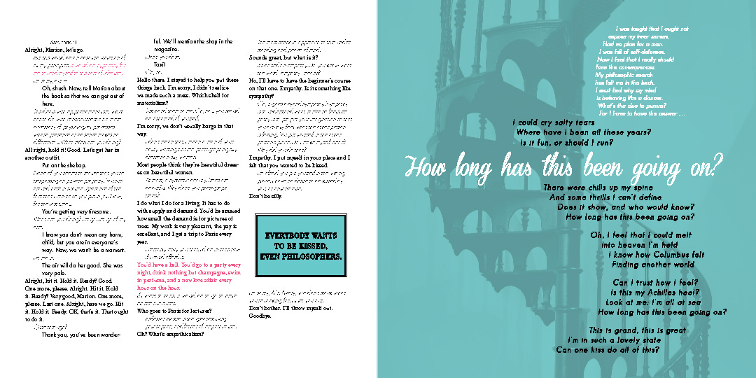
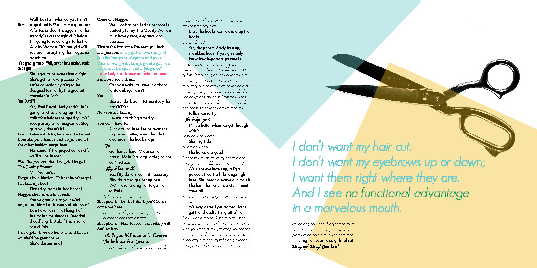
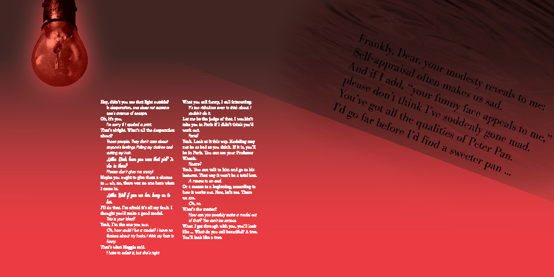
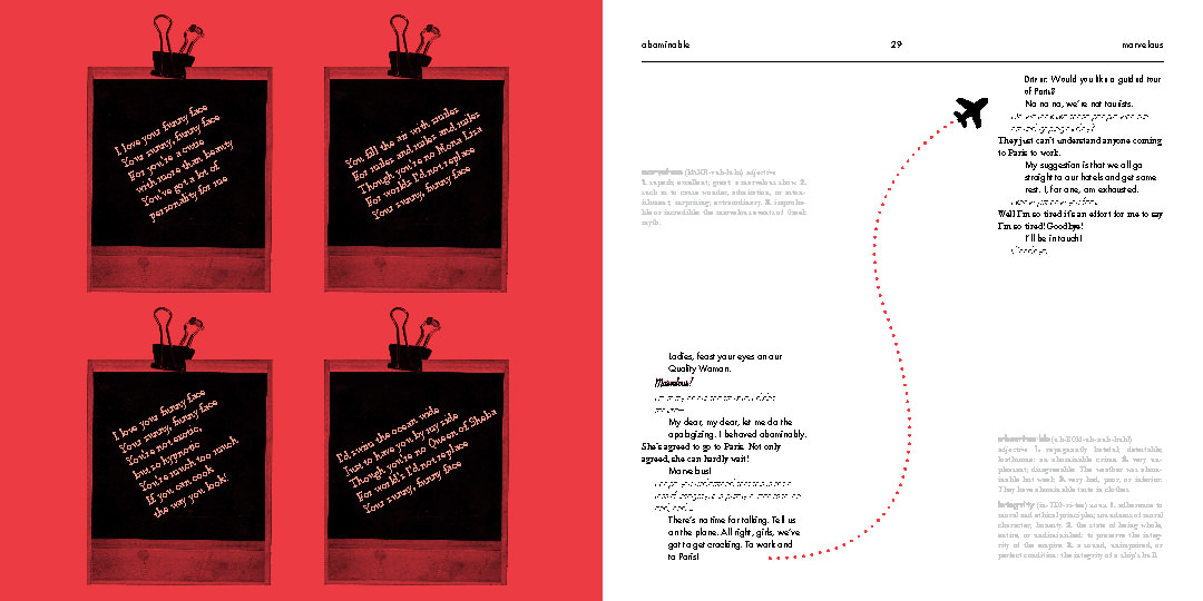
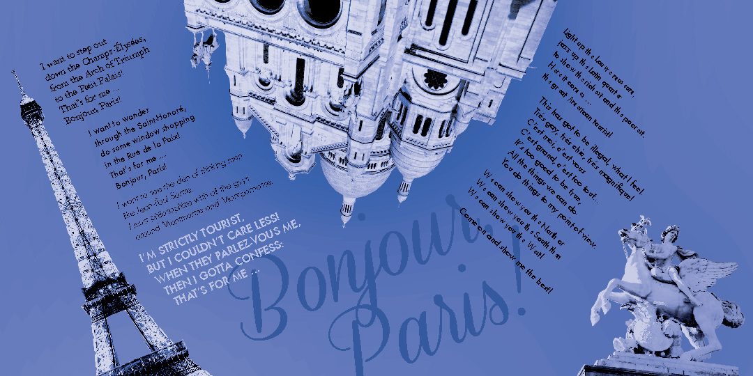
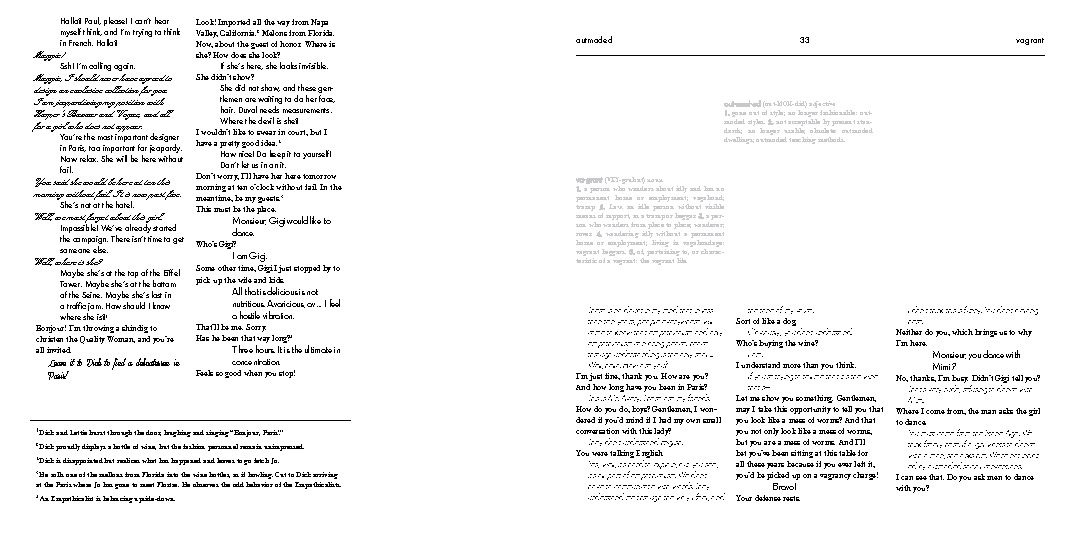
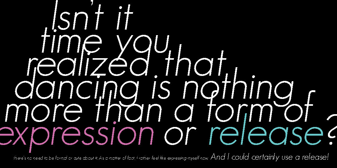
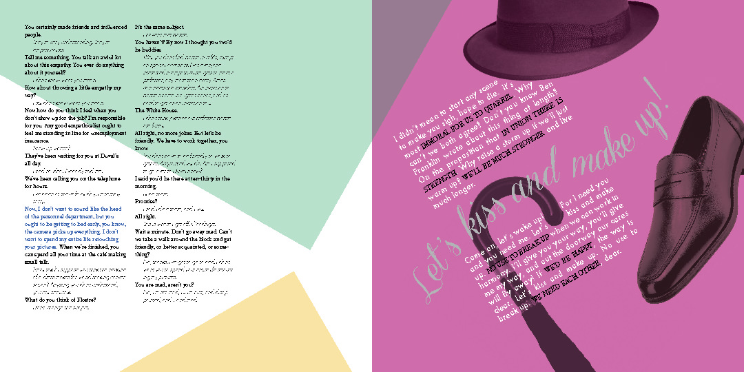
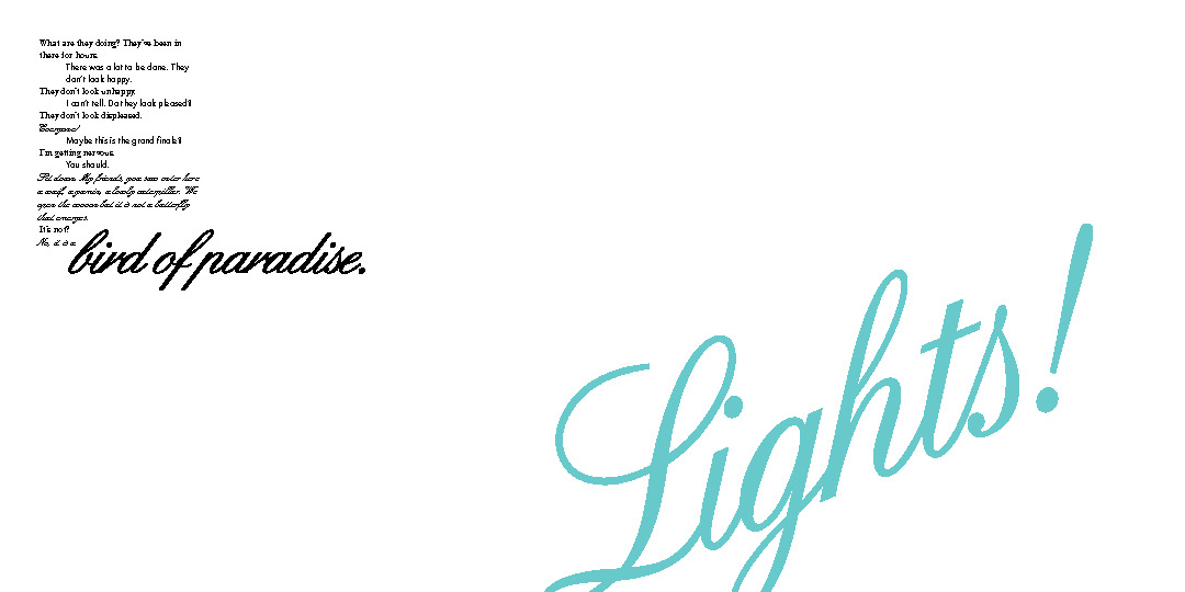
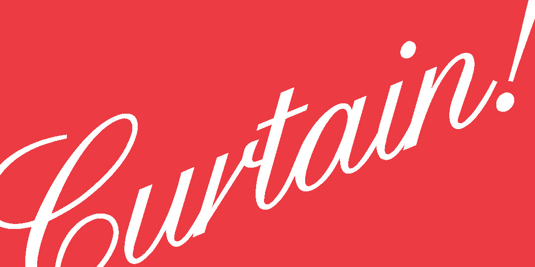
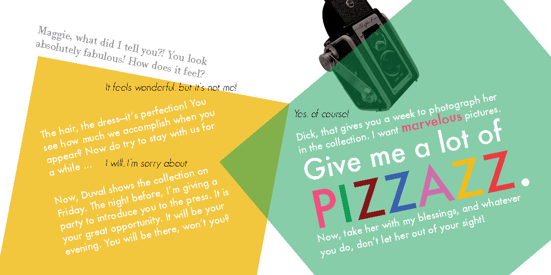
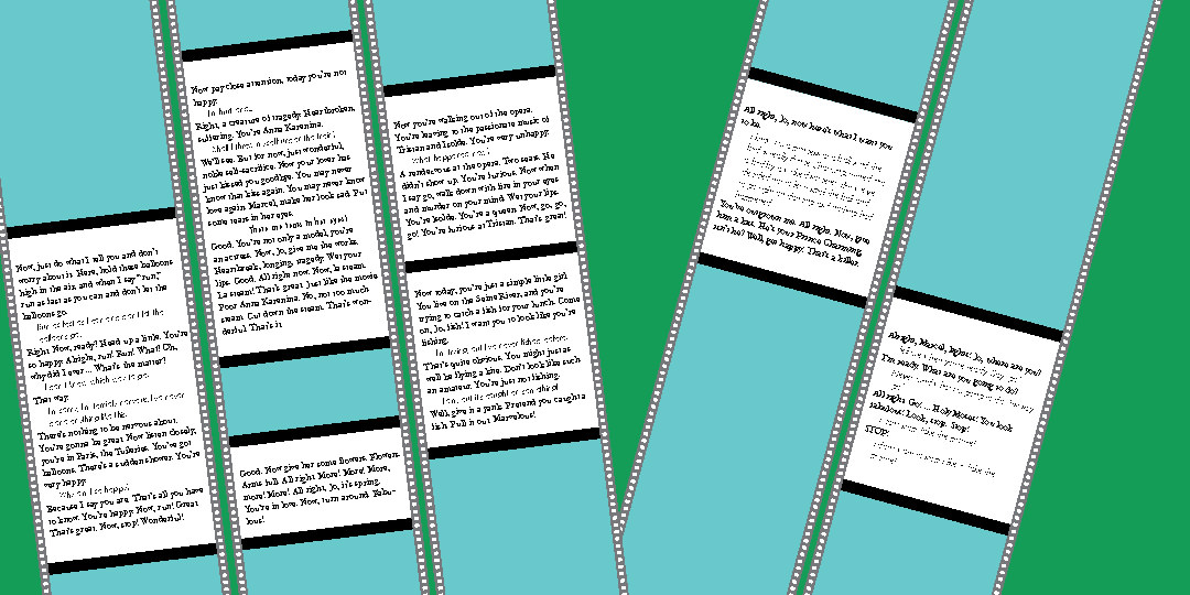
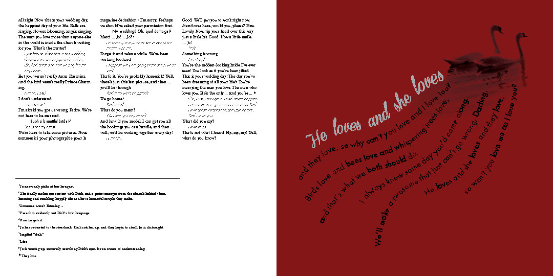
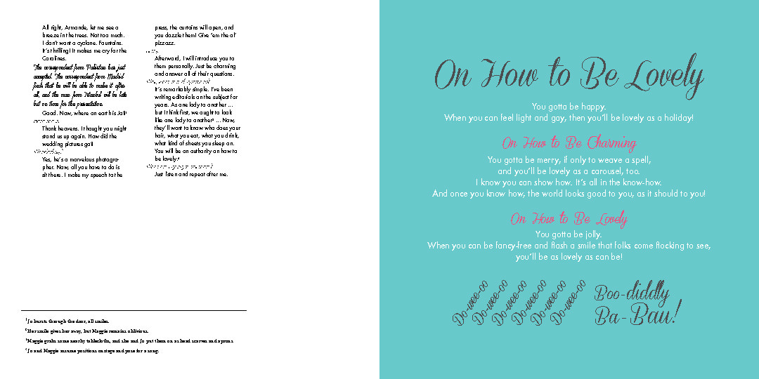
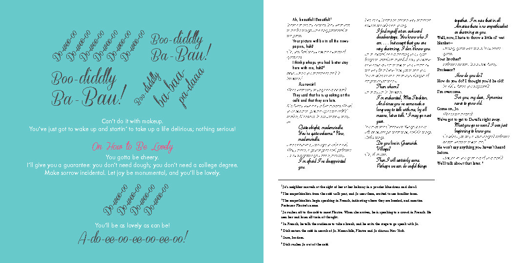
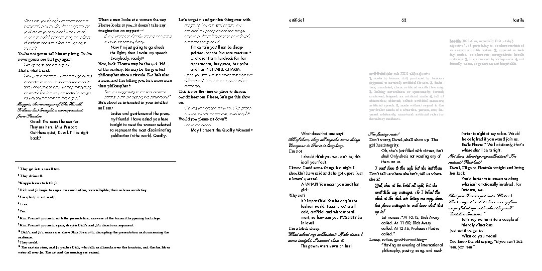
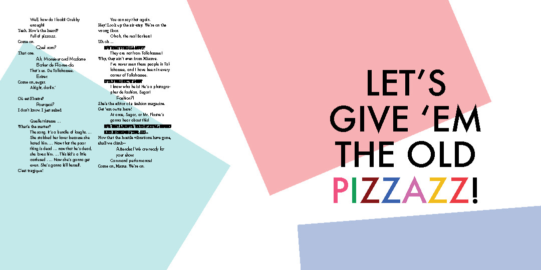
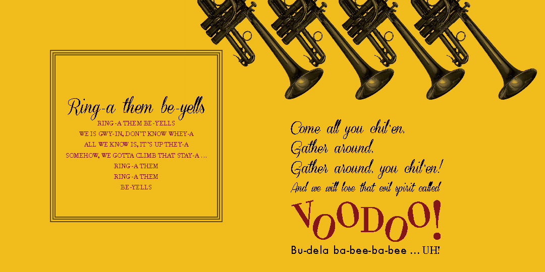
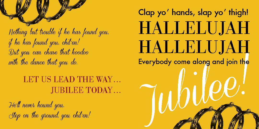
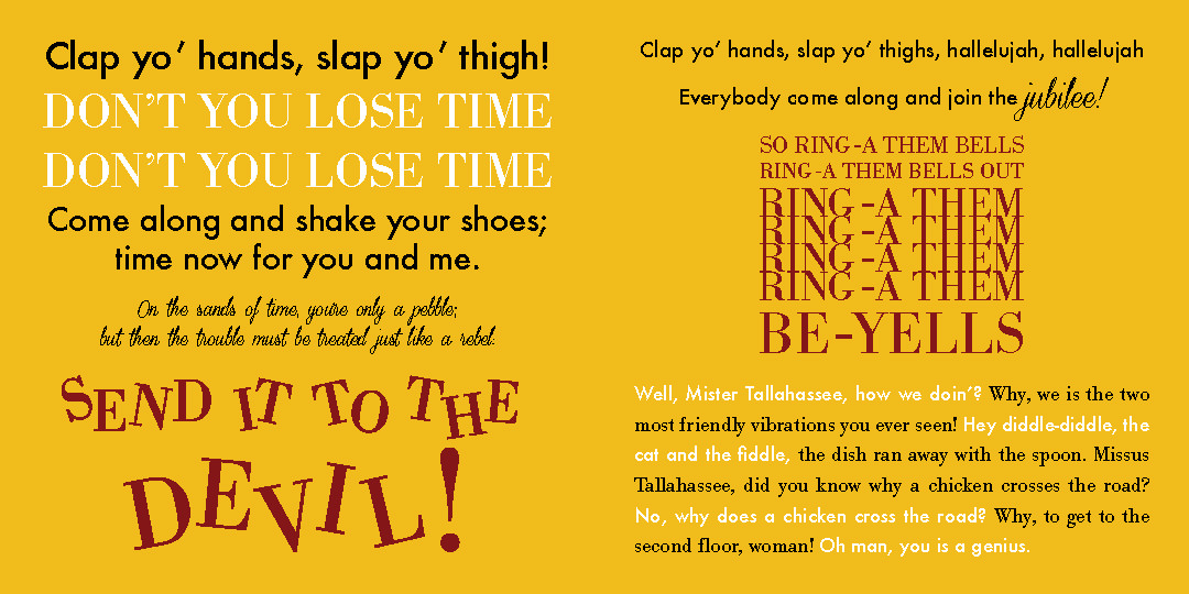
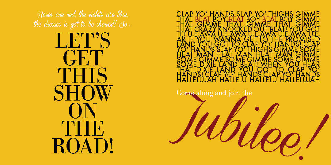
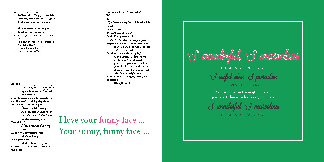
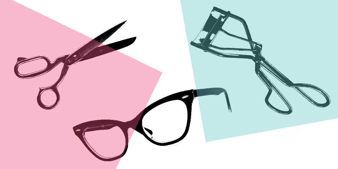
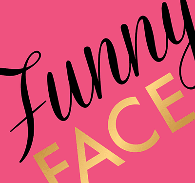
The entire script of the 1957 musical film lies in this coffee table book I designed for an experimental type class. Each character has their own typeface, and the words are designed to visually reflect the energy on the screen.

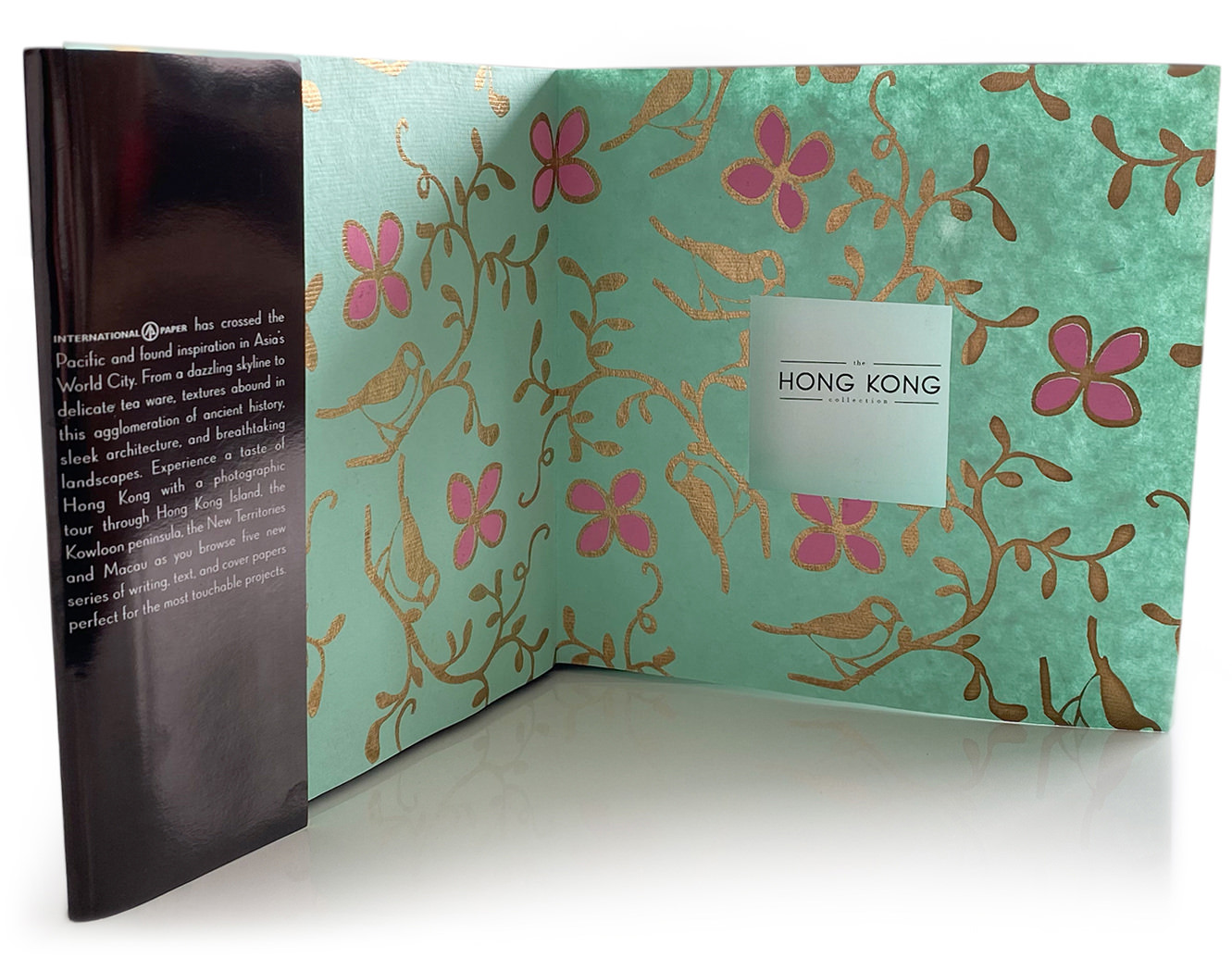
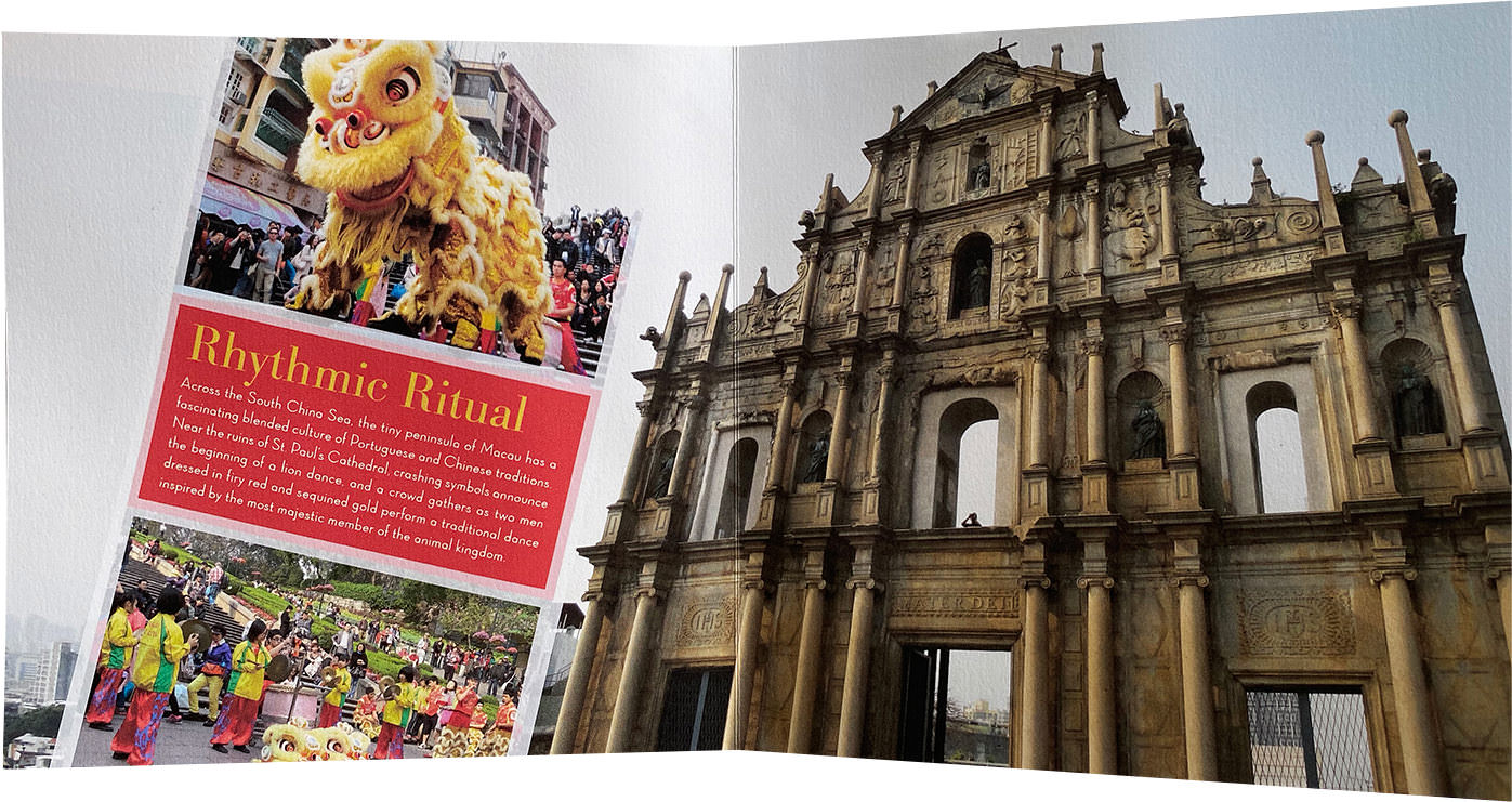
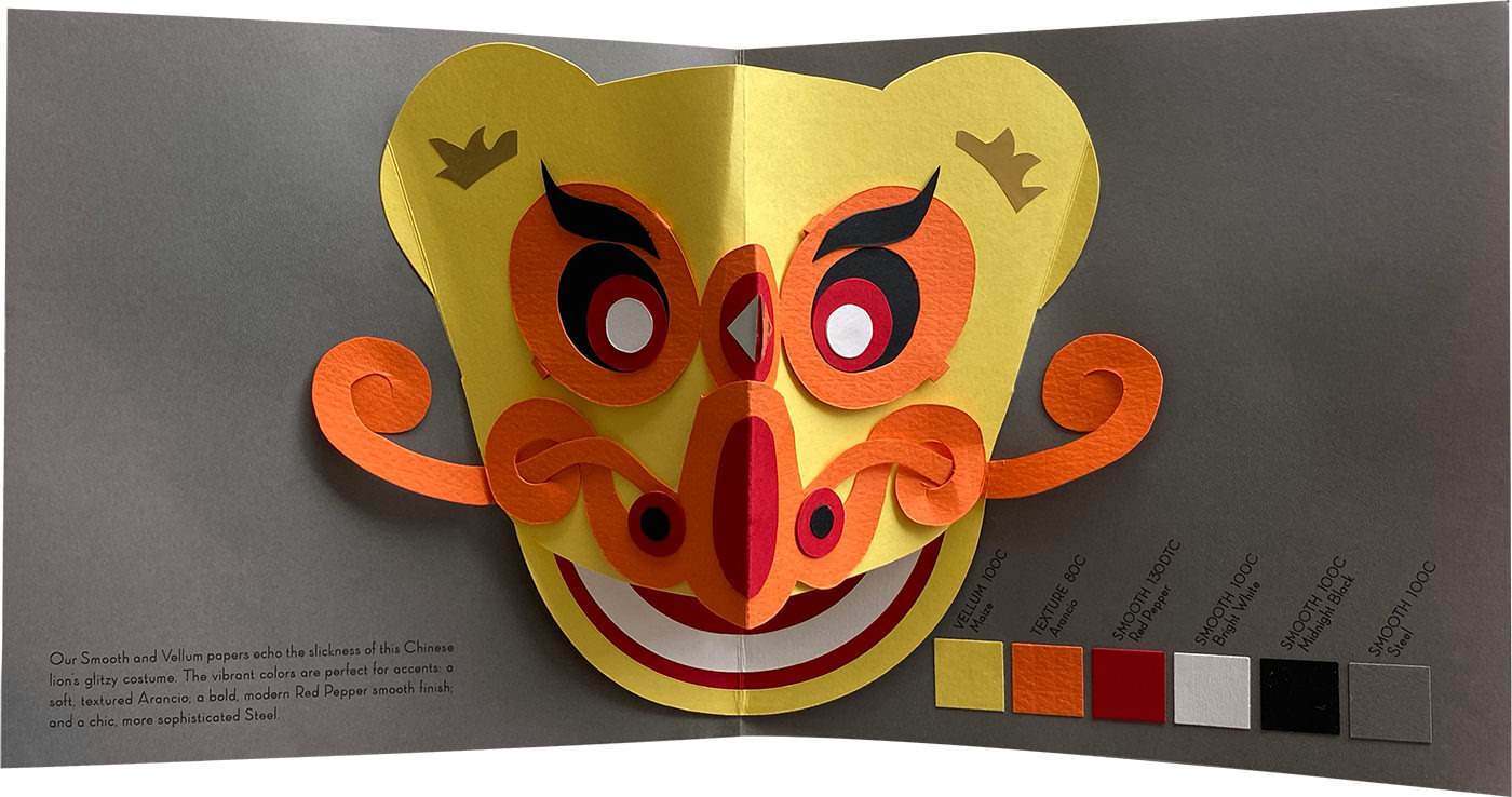
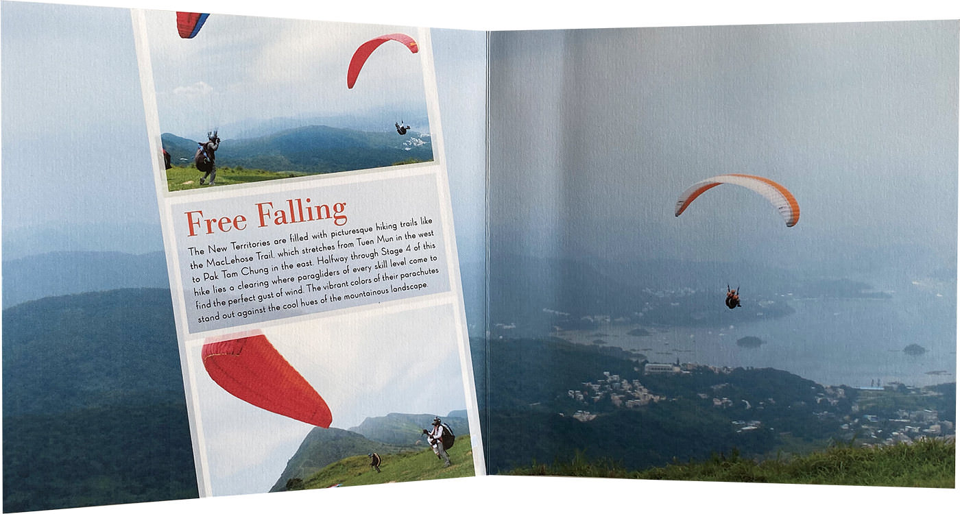
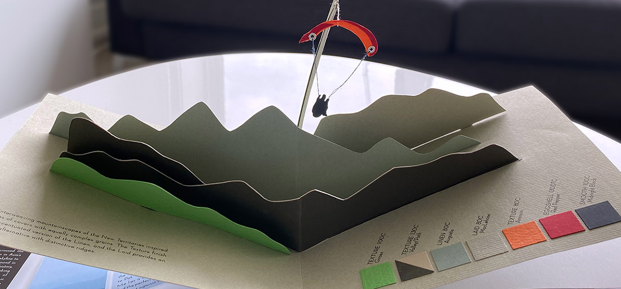
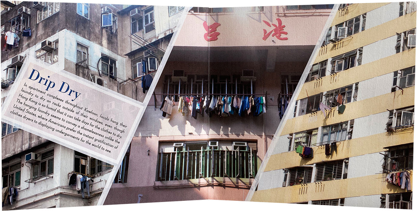
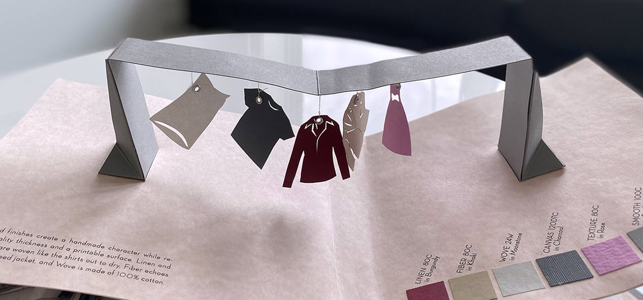
A luxury swatch book was assigned shortly after my time in Hong Kong, and I thought a pop-up book would be a good challenge and a fun way to honor those memories.
Besides designing and building the book, I created the InDesign files (so many die lines!) that would be used to mass produce it. Here are some highlights: