Luv2 is an interest-matching app for committed couples. It learns about both partners’ interests through brief questionnaires and suggests activities based on the couple’s responses. In addition to these suggestions, or “Luv2s,” the app also generates Luv Tips which are event-based, like anniversary reminders. Luv2 has huge opportunities for in-app purchases, advertising, sponsors, coupons, and social media integration.
I was brought on to the Luv2 team shortly after its inception and was responsible for the information architecture, wireframing, brand identity, and UI design.
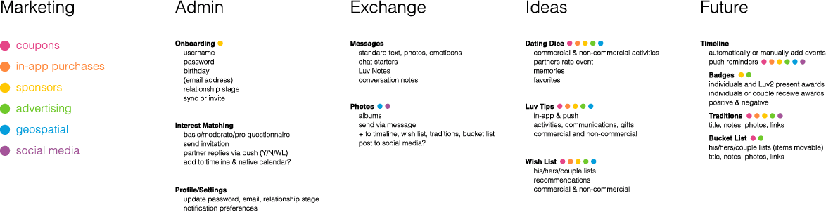
The creator of Luv2 had a lot of great ideas about what this app could do, so I organized his ideas into categories that would help us prioritize features and organize the app.
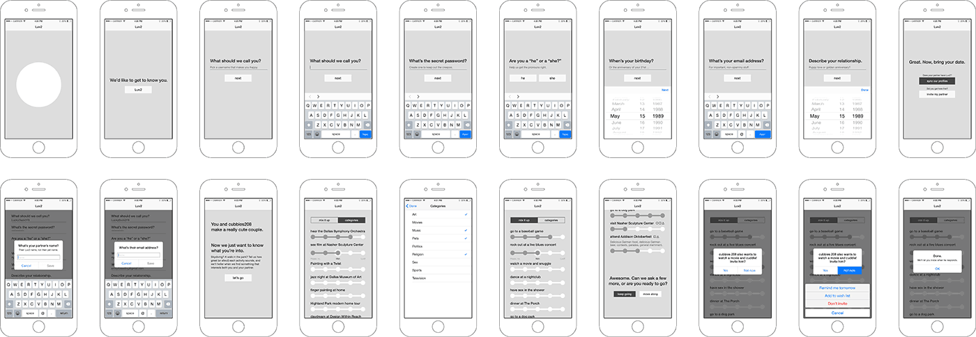
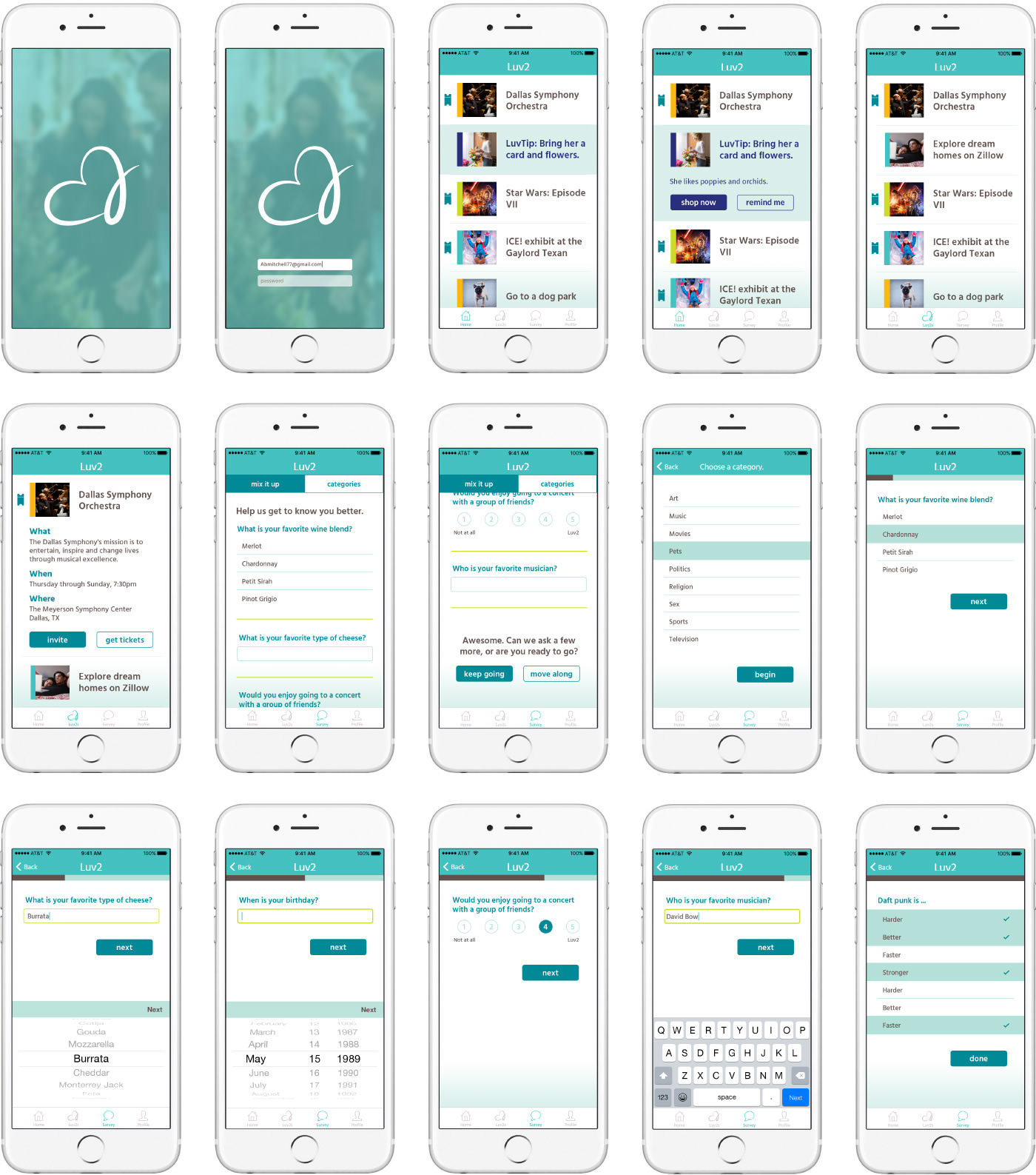
Once we’d determined which features we’d build first, I built wireframes for each screen. This helped the team visualize how features would work based on native functionality and aided our conversations about how users would experience Luv2 for the 1st or 50th time.
While the developers got to work, I developed a few options for Luv2’s visual identity:


We chose the first mark with a color scheme that better fit the brand. The Luv2 mark elegantly combines a heart and the number two into a symbol that remains friendly without being childlike or garishly feminine.
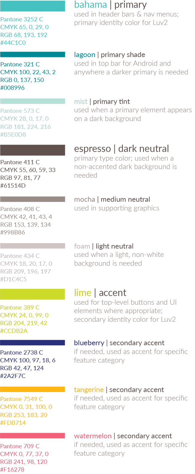
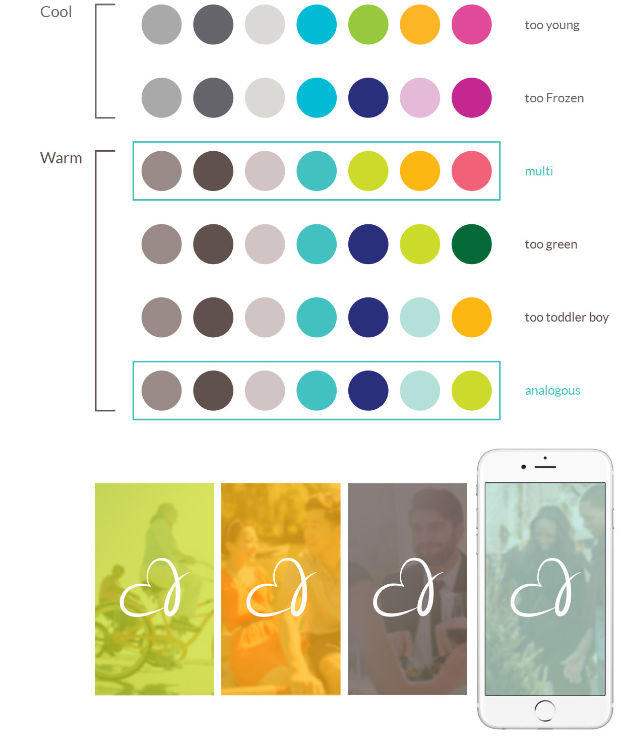
The expanded color palette is designed to appeal to all genders across multiple generations and includes light, medium, and dark primary and neutral hues as well as four accent colors. The splash screen incorporates subtle lifestyle photography that changes color seasonally.
The colors for the app icon were chosen because of their ability to stand out on a variety of busy smartphone backgrounds.

With the brand identity defined, I translated it to the visual design.
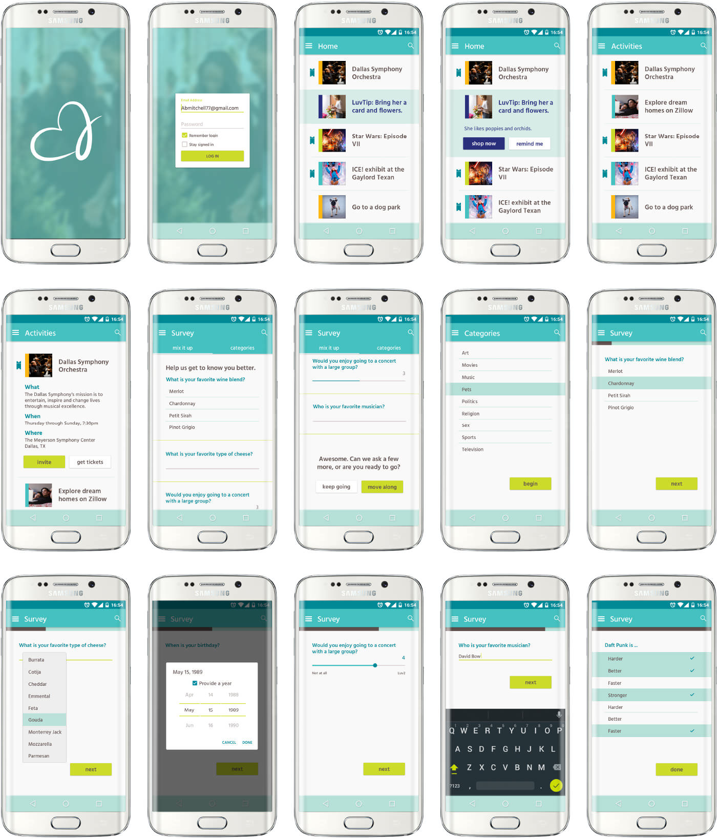
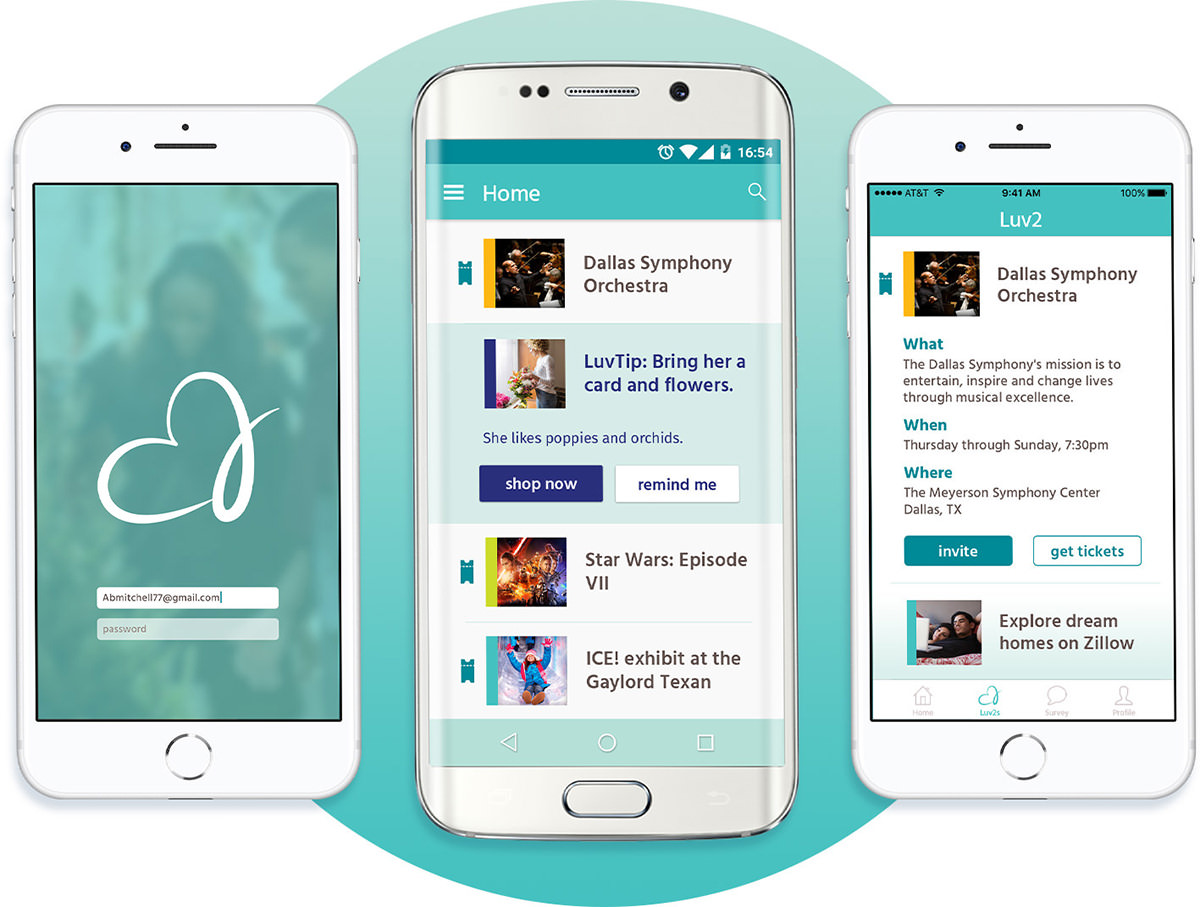
In the home feed, Luv2s are color-coded based on whether one of the partners suggested the activity or it was generated by the app. A ticket icon indicates an opportunity for an in-app ticket purchase. The expanded view of an activity gives details and allows the user to purchase tickets or invite his/her partner to the event first.
The typeface Hind was chosen for its legibility in various sizes, particularly for users who have difficulty reading small type.
The iOS and Android apps use as much native UI as possible with the same brand identity.